
SourceTree for Mac 2.0 Released!
By Steve on September 25, 2014Hey folks, we just made a major update for SourceTree for Mac available: version 2.0! The highlights of this release include a rework of the bookmarks window, and the addition of a bunch of new translations. We think you’ll really like it.

Bookmarks + Hosted Repositories = Repository Browser
In SourceTree for Mac version 1.x, you had two separate windows for your Bookmarks (local clones) and Hosted Repositories (your remote accounts on Bitbucket, Stash and GitHub). With 2.0, those windows are combined into a single streamlined window called the Repository Browser, with a ‘Local’ and ‘Remote’ switch:
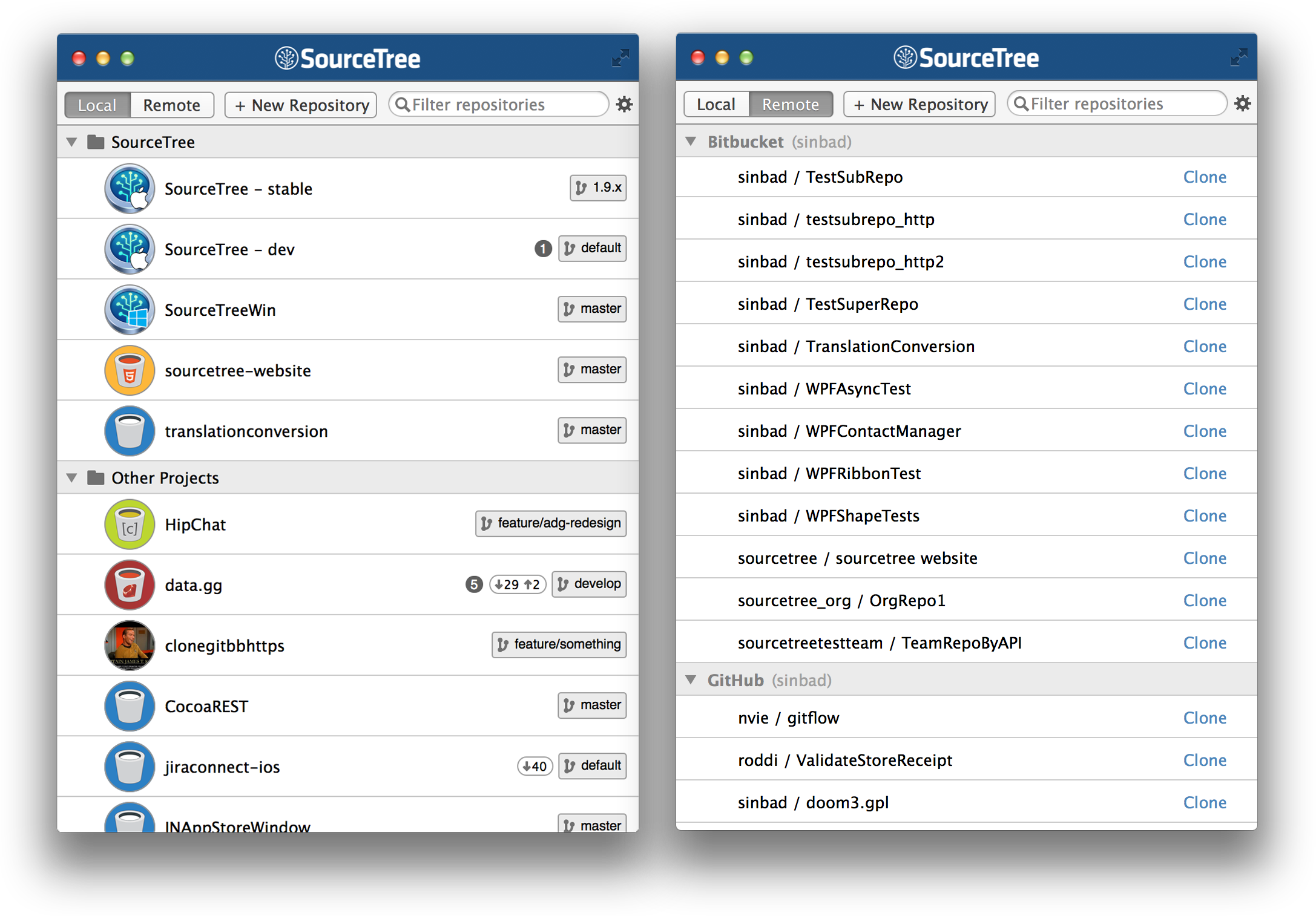
If you don’t see the repository browser on load, you can show it with Cmd-B or “Window > Show Repository Browser” from the menu.
In addition to bringing the two interfaces together, the new window has lots of advantages:
- Cleaner, less cluttered display style. Press spacebar to quickly look at more detail of the selected repository
- Repository avatars: avatars assigned on Bitbucket will appear here, or any image files in the root named logo/icon
- When scrolling, the parent group of bookmarks ‘sticks’ to the top of the view for better context
- Creating new repositories is now simpler – it’s one button
- You can now create a repository on a remote service (Bitbucket, GitHub) at the same time as creating a new local repository
- Easily publish a local repository to a remote service of your choice by right-clicking then ‘Publish to remote‘
- More optimised bookmark refreshing
New Translations
You guys have responded brilliantly to our request for the community’s help translating SourceTree to more languages, and as a result SourceTree for Mac now comes in 10 languages:
- English
- Chinese (Simplified)
- Dutch
- French
- German
- Japanese
- Portuguese (BR)
- Russian
- Spanish
- Ukrainian
Not all of these translations are 100% complete, our criterion for including a new language is a 60% translation rate, on the basis that this is a good enough start and including it in SourceTree will then prompt others to help complete it. If you see gaps or inaccuracies in the translation, please help us fix it at our Transifex project, and if your language isn’t included yet, please help get it to at least that 60% mark.
New icons
SourceTree has a new, flat application icon:

This brings it in line with the style of other Atlassian tools like HipChat, and also prepares it to fit seamlessly with the style of the newest version of OS X, Yosemite. Note that because of OS X caching, you might not see the new icon straight after the auto-update, you’ll probably have to restart the app manually before it’s picked up.
The icons within the application for file status, branches, tags etc have all been updated to a ‘flatter’ style too.
We hope you like the new release!
91 Comments
Windows version needs to play catch-up faster 😛
Would be nice if the windows version even WORKED. most days I get background process hangs where Sourcetree doesn’t update it’s views. No amount of tinkering fixes it, and it needs restarting to refresh the view.
It’s always done it off and on, but the 1.6x stream is 10x worse than it’s evern been. Also staging items takes about 8 seconds per file, tick the tickbox, wait….zzzzz
It’s truly awful, and it’s sad to see the Mac version getting all the love when the Windows version is so broken, and behind in features.
We have been REALLY pleased with Atlassian products (Stash, Bamboo, JIRA), but Sourcetree is the one our developers are always complaining about.
So is it possible (and how) to change these new repo icons?
https://cloudup.com/cnEUZSzWAO4
Yes, if you’re using Bitbucket and you assign an avatar to your project it will show up in SourceTree – that’s how all of the icons in the screenshot are displayed. If you’re not using Bitbucket, SourceTree will also use any image file it sees in the root of the project if it’s named [icon|logo].[png|tiff|jpg|gif].
Note that to keep remote requests down SourceTree only checks for icon updates every week by default, if you want to force it to refresh (if you’ve just changed the icon on Bitbucket for example), click the gear icon in the corner and then ‘Refresh Logos’.
Awesome. Thanks!
Could you elaborate on why this release was designated 2.0.0 instead of 1.10.0? I’m happy to see Sourcetree updated, but the two features presented here don’t really scream MAJOR release to me. I was hoping the blog would detail why 2.0 was a big deal (i.e. a lot of bug fixes, a lot of under-the-hood improvements, etc)
Given that the bookmarks & hosted repositories are such a central feature of SourceTree, rewriting both of them is a pretty major update. Plus, personally I hate double-digit minor releases, they tend to get confusing.
Ah…I guess that’s a feature we never really use :).
Oh well, there’s plenty more in the pipeline for the future that hopefully you’ll use 🙂
Version 1.9.x came with breaking changes and deserve the version 2.0. Can you elaborate why double digit minor versions tend to confusions? Do you know http://semver.org/?
I’ve run large projects before which had double-digit version numbers (going to 1.10) and always had people getting confused about whether 1.10 was lower than 1.9 (reading it as 1.1..).
So because ppls can’t count up to ten, you put breaking changes into minor versions and trivial changes into major versions?
Since we’re not an API, there’s no such thing as a breaking change.
I call it a breaking change when I update from one minor version to another minor version (1.8.1 -> 1.9.0) and the whole interface changed and is not useable anymore.
Breaking changes have nothing todo with “being” an API. It has to do with breaking a workflow – doesn’t matter if this means a piece of code has to call other parameters or the user has to complete change his workflow.
The “it’s not an API” argument belies a narrow mindset and reveals a lack of consideration for the very purpose of version numbering for the human end user.
Have you happened to notice the marketing version number of the next version of Mac OS X? You know, the operating system for which your app is designed?
(That’s right, it contains not one but two double-digit version numbers! Mac users—the very audience for your app—are doomed!)
Also notice that everyone refers to it by its codename. 😉
I’m not going to argue this point, I have first hand experience of it in other projects.
Great work, love using SourceTree for Mac!
Just finished installing the update. First thoughts: Since I don’t use any icons for my repos, but have a lot of them, it would be nice to disable the logos to have a more condensed list.
Yup. Just more vertical space wasting design. Some of us work on laptops and without 30″ monitors attached. This space wasting is also in seen in the working copy file listing with those silly separator lines. For that view, they should revert back to the “banded” format we see in the branch view commits listing.
We might add a ‘compact’ view in a future update – still with icons, just no higher than is needed for other elements.
oh please PLEASE, pretty please with a cherry on top! now the usability dropped down a lot!
I’ve actually already added the compact view option for the next point release. :p
can we have it like naow? pleaaaase? :DDDD
Yes please now! Just a complete waste of my screen real estate. I have zero need for icons for our (non-github, non-bitbucket) repos. Did anyone actually ask for this feature and how did you reach the conclusion that silly icons would provide any kind of value?
Yes, Bitbucket users find it pretty awesome actually. 2.0.1 with the compact option will be available probably later today.
Compact view in 2.0.1 looks better. Thanks.
Now can we get the system default colour for the bookmark view title bar? Not only is the arbitrary blue colour selection out of place for an OSX application, it’s not even consistent with the rest of SourceTree.
I’m getting 100% CPU usage when I open only 1 repository, anyone else has this issue? The fan on my Macbook Air is going crazy 😉
My CPU usage, when doing nothing with ST, shows 22-28%. Something doesn’t seem right there does it?
SourceTree does check remote repos automatically in the background (if you have that enabled in Preferences, default is every 10 minutes) but in my tests it doesn’t use more than around 5-6% when that’s running.
If you have excessive CPU usage like the OP please raise a bug with more details at https://jira.atlassian.com. Preferably attach a process sample by using the gear icon in Activity Monitor and clicking Sample Process.
Still haven’t addressed the fundamental UI/usability regressions from 1.8 (e.g. spurious whitespace, width and button positioning in the diff pane, locations of file list and commit info, etc.). Disappointing.
I would say they added more – now in repository browser (bookmarks view) – argh, why?!
Also, the icon which shows the branch you’re working with is almost the same as the icon for other local/remote branches… I keep pulling changes w/o being on correct branch.
Why is the interface continually being dumbed down by hiding important information? Now I have to press the spacebar on each repo (I have many) to see valuable information such as files added, modified, etc. Yes, I see the count of all files changed, but that is near useless info. I’m forced to check the repo (each one), to see what this total represents. On a positive note, I do like the new app icon.
New version never lets my CPU idle. Usage for ST2 continually floats between 22-28%. Something is not right. Again, staying with 1.8.1
as mentioned earlier, my pet peves with this version:
– wasted vertical space in bookmark view – huge icon (same for all local repositories =,=)
– valuable information missing (need to press space… for all repositories?! wtf?!)
– somewhat non-default titlebar in bookmark view – all apps are uniform grey yet only ST stands out with blue-ish one, which drives nuts my inner ocd…
when to expect the new version for windows?
This is one thing that everybody is complaining: http://i.imgur.com/ClUQHs1.png
Another thing is that everything is too white and bright. I guess the designer needs to calibrate the monitor. My eyes are hurting after looking at the app for couple of minutes. I guess I am still staying with the 1.8.
Thanks.
+1 I’m not aware of any new feature beyond 1.8 affecting or benefiting me. After that all I perceived was unnecessarily reinventing OS widgets and making the UI worse.
The new bookmarks window looks like someone rendered a responsive web-page in an WebKit view, it doesn’t feel at home on Mac OS X at all.
Agreed. I try every new release of ST just to see if there is something magic that will make me want to upgrade from 1.8.1. Sadly, there is nothing new under the hood except new bugs, and the “upgraded” UI/UX experience is disappointing – Wasted space, valuable information and settings hidden away, UI elements that follow no standard (e.g. jumping checkboxes). Even labelling the massive jump from 1.8 to 1.9 as a point release, then calling the recent bookmark changes 2.0 is baffling. I can’t help but think that Steve S. has moved to a different position within Atlassian and someone else is the actual project lead. In fact, I recall an Atlassian job posting some time ago for the SourceTree project lead position.
Exactly. The strange thing with these UI design choices is the dichotomy: on one hand, it is presumed the user has a massive monitor in order to tolerate all the wasted space—but on the other, it must be presumed he has a tiny monitor so as not to be blinded by the swaths of unduly white panels.
Hey, it’s a free app, I know. But could you guys *please* work on the tool and leave the UI graphics alone. The Bookmarks were perfect as they were – perhaps an option to attach them to the main UI and Repo Tabs (both as in the Windows Version) would be a nice litte extra – but that’s about it. Emphasis on nice little extra here. No need to rush that.
By the way, the new bookmark design looks like ass. Get a designer to do it. If that was a designer, fire him. The UI Toolkit looked just fine in the last version – switch back to that.
Two more things:
Export feature? Please? Export of changes between version x and y would be particularly neat.
What’s with the Windows Version? Dead? Or just slower to develop?
All that aside, thanks for the great tool, will continue to use it.
I hereby make a plea for Atlassian to release 1.8.1 as open source. I would gladly contribute to making improvements based on that fork.
Interessted in a FOSS x-Platform Git GUI Project? … Should we start one? I’m a C++ n00b, but would like to get into it. How about building a Tool in Qt? Or pitching in with Giggle?
Mac, when SourceTree is hidden (⌘H), it takes 100% of CPU…
I can confirm this happens to me as well. At least over 90% CPU usage when ST is hidden. I’ll book an Jira ticket on this one.
Ah you’re right, seems specific to being hidden with Cmd-H rather than just backgrounded. Will investigate.
[Edit]: being tracked at https://jira.atlassian.com/browse/SRCTREE-2684
Can confirm that this happens to me too.
Meh, after a day with it I (again!) went back to the older version… new ones simply look terrible and amount of wasted whitespace is simply ridiculous… this is supposed to be a tool, not a wet dream of some wannabedesigner… :/
Way worse than before. You just broke a very useful tool. Guess I got to learn HG CLI. Bye…
Am i blind – how do I create groups in the bookmark window now?
You can do this on the right-click menu as before, or at the bottom of the ‘New Repository’ button at the top.
Found it! ta
Wow. It’s actually getting worse. I’m not even talking about the horrible use of whitespace. I’m talking about the total lack of understanding of UI / UX. You don’t understand how checkboxes work. You don’t understand what information needs to be visible at a glance, and not hidden behind a space bar, or in a dropdown menu.
You’re changing stuff just for the sake of changing it, and you’re making stuff worse.
Please stop.
Please open source 1.8.1.
Please.
Using SourceTree on OSX Yosemite where version 2.0 seems completely broken. Anyone who has a link to an older version? (thanks)
We haven’t seen any issues on Yosemite, please file any issues at https://jira.atlassian.com
Sticking with 1.8.1…again
Anyone using any decent alternatives!?
Since 1.8.1 started crashing randomly, I switched to Git Tower http://www.git-tower.com
Unfortunately, Git Tower randomly crashes for me. I’ll have to stick with SourceTree 1.8.1 for now. I can’t believe the UI/UX missteps the continue to occur with SourceTree.
Gitbox
I agree that the new icons are way too big and there should be an option to disable the logos. More importantly, unless your repos have giant enormous names, there is plenty of space to show the number of files added/removed/modified. This should be primary information; it should not require pressing the space button.
After upgrading, the git repositories with pending pushes won’t open anymore. Any fix for this? Working with command line git is quite annoying. Using OSX.
We discussed on Twitter but for anyone else: this is fixed in 2.0.1 and was specific to some Yosemite installs.
Every so often the app disappears and I’ve got to reinstall it off the website.
Fire the graphic designer and the ux “ninja” .. I don’t use icons, now they waste most of bookmark panel. The panel is ugly, missing info, label are ugly pixelated, not usefull. And you managed to sneak some design changes into the app – icons to indicate file changes have so bad contrast ratio, are very bright.
And still, SourceTree can’t store my password, when accessing TFS GIT (no SSH, old plain password style). Still. This can’t be that difficult to fix.
I’ve been trying to get the logos to work and have had no luck. My bitbucket logos are not coming through. My stash repos with images named “icon/logo” are also not working. Is this common?
We don’t yet support Stash project icons, only Bitbucket and local (Stash will be coming). If you’ve added the BB icons recently then they won’t be picked up straight away – to avoid doing lots of extra queries and downloads we only check your BB repos every week. If you want to force the refresh, click on the gear icon in the top-right and then ‘Refresh Logos’.
I’ve been trying to get this to work since this blog was posted. Bitbucket logos never came through. The physical file in my repo has not worked. Logos just don’t seem to work in any build (now running 2.0.2).
Thanks!
That’s odd, I use them quite extensively with Bitbucket. Please can you log an issue at https://jira.atlassian.com with any messages from Console.app related to SourceTree?
Will-do! Thanks for all the awesome.
PLEASE!!!! change the theme back!!!!!!!!!!!! please change the theme back!!!!!!!
Maybe prioritize the Windows version, what a beast crap piece of junk is that to work with since the last update.
Hi,
Do you have Google+ profile?
Anyhow, could you offer Portable Version for Windows?
Thank You.
The AppStore version is still not updated.
Hi Jash,
We’re no longer able to publish to the App Store due to sandboxing. Please see here: https://blogs.atlassian.com/2012/02/between-a-rock-and-a-hard-place-our-decision-to-abandon-the-mac-app-store/
Cheers
The ‘header’ is buggy when changing to full screen in Yosemite
Low contrast file status icons are terrible.
For something thats free you people are complaining a lot.
instead of complaining be nice and make it a suggestion.
A your using git your probably a programmer, how would you feel if someone is banging on your work you do for free.
Love the app sure a minimalistic view would be great, but for now i just made extra folders and just open the one i need.
Amazing work, you guys. A trillion thanks for making this free!
BTW, the people bitching hardcore about this free tool should STFU. At least be more polite when requesting features/changes. This cost you $0.
Question: How do I set an icon for a repository?
“Repository avatars: avatars assigned on Bitbucket will appear here, or any image files in the root named logo/icon”
So if you’re not using Bitbucket, any icon.* or logo.* image file in the root of the repo will be used.
Thanks Steve, sorry I missed that.
I’ll say it again: ignore the haters. Everyone has an opinion these days, and I find it amusing how easily they’ll criticize free software and content. You guys are doing a killer job, SourceTree is leagues above anything else out there, and it’s a huge gift to all of us developers that it costs $0. Thanks!
I must say that I prefer the windows client to the Mac. On windows I’m running 1.6.12 (latest that my company has approved) and on Mac I have 2.0.5.2. I really like having the bookmarks in the same window as everything else and being able to see at a glance if a repo is update and how many commits or pushes I have pending. I don’t know if you took that feature away and my version is just out of date, but that is one of the most usual features for me personally. I don’t like that I have to open/switch another window to open a different repo. In that workflow I have 3 windows open (repo 1, bookmarks, repo 2). I really like this tool and for $0 you can’t beat it. I just find that the Windows app is better designed and easier to navigate than the Mac tool.
Is there a dark theme ? Or is theming present in sourceTree ?
Not at the moment.
Sourcetree’s new setup assistant is actually broken, it won’t continue to my branches/repos so I can’t use sourcetree at all. Great update!
Sourcetree’s new setup assistant is actually broken, it won’t continue to my branches/repos so I can’t use sourcetree at all. Great update!
Hi, you claim that your current version runs from OSX 10.7 and beyond. I have OSX 10.8 and look… http://cl.ly/fJTf
Sorry for the confusion, in the process of updating our websites. The latest release supports 10.10 or greater.