
SourceTree for Mac 1.9.3 : new view options based on your feedback
By Steve on May 30, 2014It’s always difficult to make changes to an established product, and SourceTree for Mac 1.9 was no exception. Our goal with 1.9 was to make some of the core views more approachable to new users while retaining what brought more advanced users to SourceTree in the first place. We prototyped, user tested and dogfooded for some months and believed we’d got the balance right.
Things are never that simple though, right? The feedback we’ve received from the wider SourceTree community since indicated that although many people did like the new style and found it more approachable, a lot of existing users thought we simplified things too much, and removed some of the options they really liked in the file view and were core to their workflow.
We listened; today, we’re releasing an update to address the major points you raised.
More View Modes

You can now choose between 3 core view modes in the file list:
- Flat list (single column) – this was the only option previously in 1.9
- Flat list (multiple columns) – splits the flat list into separate columns for file name and path
- Tree view – clearly very popular and makes a comeback in this release
If you’re using a Git repository, you can also choose how you view staged changes:
- No staging – ignore the index and simply commit files that you check
- Fluid staging – staged and unstaged changes are in one list with headers between (previously the only option)
- Split view staging – the view is partitioned vertically into staged & unstaged panes which scroll independently. This also brings back drag & drop to stage/unstage.
Commit Selected
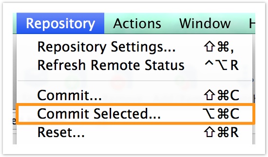
The ‘Commit Selected’ option was removed in 1.9 because you can do this by checking the boxes (when not staging) to commit files, but it became clear that it was still a useful shortcut for people. So the feature is back; if you’re not using staging it simply flips the right checkboxes for you and opens the commit popup, if you are using staging then SourceTree temporarily switches to the ‘No staging’ view and checks the boxes so you can commit selected files, then flips back to the staging view afterwards (with the staged changes from before preserved if you didn’t check those files).
There are other changes too:
- Fixed a ‘stuck refresh’ case
- Line selection in diff views is now preserved over refreshes
- More details in the full release notes
Thanks for your feedback and understanding, we hope you enjoy the new release.
51 Comments
This is much better. Thanks for listening to the feedback. A sign of people who care 🙂
We definitely do care! Design revisions are always hard to gauge even with user testing & betas but we do our best to navigate the waters. Glad you like the update.
Glad you listened to the feedback! but before tyring it out – does the huge spacing remained in the new version?
The design style remains the same for the moment, yes.
Just tested it – from the functional point of view it’s waaaaay better than 1.9.0 and I’m actually considering upgrading. However the design style is so-so… the spacing on file list causes a lot of wasted space (IMHO) and also ammount of white spaces (no two colors in file lists nor commit lists, background in diffs, etc) makes the UI a bit taxing after longish looking (yes, I’m from the dark side 😉 )
We had the spacing debate internally too 😉 If enough people demand it we might consider a few more visual customisation options but for now we’re seeing how this sits in the short term.
Well, I don’t think it will create same furry as the other chanegs from
1.9.0 but still – it’s a bit annoying so I hope that maybe some day it
will have some tweaks 😉
Remember Steve, this is a developer tool, not a tool for the everyday user. It feels like your internal discussions are forgetting that. Just because you CAN do something doesn’t mean you SHOULD. Developer tools value functionality over the pretty factor, and this waste-of-space spacing in 1.9.x is a perfect example.
I like that tree view and staging view are back, but like others have said, it’s still a far cry from where Sourcetree was in 1.8.1, and you have yet to do any public user trials on new GUIs to actually garner feedback on the changes you’re making. I’m still in the camp of users who think it would be better to backtrack and start form the 1.8.1 codebase (except that I’m happy the hung refresh bug is finally fixed, wish it could be in a 1.8.2).
The reality is that if you wanted to execute this properly with your users, 1.9.0 should have been 2.0.0, and there should’ve been a public beta with an open feedback channel so that development could have been proactive rather than reactive. When developers code re-actively, changes of introducing bugs and making mistakes are greater as deadlines are often tighter.
Believe me, we had a LOT of debates around this area and tested with devs at different levels. I’m a relatively advanced developer myself, but not everyone is and feedback from other developers and newcomers to ST often contradicts my own gut instincts (which are along the same lines as yours). We might think our own preferences reflect the majority but that’s not always the case. It’s really not as simple as you might think to get the balance right, and that’s what we’re exploring now.
Would very much like to see lower spacing.
I’m very impressed at how you guys have responded to the feedback. I’m still sticking on 1.8.1 because of the spacing (I’ve mentioned before I’m a unity dev; so I can get very long checkins); but that’s all that’s holding me back now.. Thanks again for your comprehension and taking our views on board. I was so sad that I’d have to consider using github, sourcetree is the best SVC tool I’ve used in 20 years. 🙂
Welcome changes. The ‘Flat list (multiple columns)’ view would also be useful when viewing the file list of an existing commit, as it was before.
Yeah we focussed on getting the file status view done for this update but I have a TODO item to revise the commit file list too.
Nice! Will give 1.9 another go. Change is never easy, so may just take some time to get used to it.
Excellent, thank you for listening to our feedback, very happy with this update!
Thank you, thank you, thank you and Thanx!
Better, but still not nearly as good as 1.8.1. Why not go back to the clear and understandable way of supporting the same file views everywhere? And why not go back to the old not so wasteful spacing in file list? I recommend you go back to the 1.8.1 code base, and then think long and hard before you remove features and design that works. Have you ever hear of the concept of not fixing what is not broken, and the concept of refactoring before rewrite?
I’m sure you care about your users, and I appreciate the attempts to fix your glaring mistakes with 1.9.x, but can you honestly say that you did proper user testing before 1.9 or that you actually are proud of changing a great tool into something mediocre? Sorry to be so negative, but your handling of 1.9.x have been a series of schoolbook examples of how to not develop software.
Sticking to 1.8.1, even though it feels rather bad not to be able to run latest version. Very, very, disappointing.
Sorry, I don’t agree with anything you’ve said. I think the new view looks far better, the commit method in general is tons better than 1.8’s silly popup window. And the view for commits is nice now that split view is back.
“No staging” is also nice, as thats GitHubs works, so it will be natural for those users.
To me, it sounds like you’re just being a bit too picky over the way something looks because functionally it is now the same.
Josh, just look at how many users are complaining in the bug tracker, myself included. It’s not just ‘being picky’ for the sake of it — it’s because, while certainly imperfect, 1.8 was a very good tool for the job and 1.9 looks and feels like an early beta — removed features, some more difficult to access, degraded usability, worse performance, confusing UI with numerous inefficiences and inconsistencies.
That’s not just ‘being picky’, that’s what happens when a major redesign is done in one go, without an opportunity to listen to the user feedback. I believe the way changes have been introduced is one of the ‘schoolbook examples of how to not develop software’. If Atlassian were introducing the exact same set of changes gradually the community would have a chance to speak up and the design would be adjusted bit by bit. It would perhaps take a bit longer but the end result would most likely be of much higher quality.
I’m sticking to 1.8.1 too, until the functionality of the 1.9 series is on par with 1.8.
I don’t mind changes. I do mind reduced usability.
Thanks for listening and making changes – both the treeview and also staging.
Awesome, I much prefer split view as I was constantly ticking 1 file then clicking the tick for “all” as it moved down to where my cursor was! Very happy the view is back!
First, thanks for bringing back some of the more popular features that had been removed in 1.9.0. This version is almost usable, but I will still remain on 1.8.1.
* File listing still wastes too much vertical space.
* The alternating row shading/striping (as seen in branches view) should be reinstated.
* Font size of file listing in Working copy view is smaller than 1.8.1. and should be increased to at least match 1.8.1. Personally, I hope that font sizing for various views will be adjustable in the future.
* “Discard hunk” needs to go back to the bottom of the hunk you just scrolled through and read. It should also be returned to the left.
* Visual differentiation between hunks needs better (original) definition. This would have alleviated the problem with the relocation of the “Discard Hunk” button.
* Buggy “Commit Selected”. The selections change randomly as soon as you use that option.
* Sort by path in multi-column view not sorting correctly. Attached is a screenshot comparing 1.9.3 to 1.81. This same screenshot also nicely illustrates some of my other grips with regard to 1.9.x font size change, loss of row striping and vertical space wastage.
Most of these items are already tracked at https://jira.atlassian.com already, particularly the stronger association between hunk and action buttons (we may move them to the bottom again or do something else like make them float/stick, we’re still thinking about this). Style issues are with our designer really but we’re gauging comments on spacing / fonts given a little more time in the wild.
The selection can indeed change after you hit commit selected when on the staged view, although the correct files are checked, which is the important thing. I’ll log this as a bit unintuitive though and to preserve the original selection.
The path sorting is down to ‘Path’ meaning ‘Full Path’ now rather than ‘Path, then Filename’ – an artefact of the single column view. The latter is more intuitive though so I think I may move it to mean Path-then-Filename for all cases anyway.
“Commit Selected” is broken with Hg (i.e. no staging). I select 3 modified files, click “Commit Selected”, and some other random file becomes selected. I’ve not actually tried committing because I don’t know what the heck will now be committed.
Your description of path sorting in 1.9.3 does not explain the screen shot. If file names are being ignored (which they should not, IMO), then why are the paths out of order?
The files which are checked are committed, which is all Commit Selected does; check the files you currently have selected and pop up the commit pane. It’s just a shortcut for checking/unchecking boxes yourself before pressing Commit.
The paths are not out of order if you concatenate the contents together as one full path string. public/index.html is before public/js/d3www.js, is before public/pickpack.html. It’s only when you sort by the folder THEN the filename separately that you get the order you want.
Sorry, but Commit Selected does not work for me as you describe. I open a Hg repo under 1.9.3. to my WC view. I clear all magically selected files (ST wants to be clever). I then select/check the 3 files I wish to commit. I click Commit Selected. My selections are lost and a different file is now checked. I continue to add my comment and complete the commit. None of my 3 desired files are committed, only the 1 file that ST decided to select when I clicked on Commit Selected is committed.
Paths are out of order. A file path and a file name are not the same thing. What you have said/demonstrated is that if you consider the path and file name one long string, then they are sorted correctly. While technically true, it does not represent any logic with regard to sorting by path. Having said that, I do agree that the desired behaviour is that of 1.8.1, where paths are sorted, then file names within that.
About the sorting, I just explained the logic; I also said on reflection it made sense to change this to sort by folder then filename separately. This is already done for a hotfix today.
I can’t reproduce the commit selected behaviour you describe in hg (SourceTree is hg). Please can you record a screencast & log a bug at https://jira.atlassian.com
Rereading your comments and playing with it some more, I now understand what’s happening. Commit Selected simply changes the checkbox selections to only the files that I have highlighted (selected), regardless of current checkbox status of each file in the listing.
Now that I understand it, I can see how it might be handy, but it conflates the 1.8 and 1.9 concepts of file selection. i.e. It uses the idea of 1.8 selection to toggle 1.9 selection. Maybe a name change for the feature to “Commit Highlighted” would be less confusing?
Thanks for the update!
I did not like the new staging view from the 1.9 version. Really appreciate the new options to bring back the older one!
Looks like there is some issue in this release:
git -c diff.mnemonicprefix=false -c core.quotepath=false -c credential.helper=sourcetree fetch origin
2014-05-30
17:21:06.551 git-credential-sourcetree[6067:707] Error
(internetKeychainItemForServer:withUsername:path:port:protocol:) – The
specified item could not be found in the keychain.
git -c
diff.mnemonicprefix=false -c core.quotepath=false -c
credential.helper=sourcetree pull –log origin
2014-05-30
17:21:09.421 git-credential-sourcetree[6127:707] Error
(internetKeychainItemForServer:withUsername:path:port:protocol:) – The
specified item could not be found in the keychain.
That message itself isn’t a problem – it appears whenever a keychain query doesn’t find what it’s looking for – but there is a git/HTTPS issue in 1.9.3 causing excessive prompting for access to the keychain which is being fixed right now (1.9.3.1)
Credit where credit is due, you guys believe you were doing the right thing but apparently ended up making a mistake. You listened to the feedback and promptly came up with a solution. Thank you for the changes, sourcetree is a tool I really became fond of. Once again, nice job.
Can anyone with windows let me know if treeview is also present on windows or is that a functionality that is still missing in that platform?
Thanks. Tree view hasn’t been added to Windows yet but we’re trying to get it in for the next major update.
Not a fan of the commit viewer changing back to multi-column view with no option to change it. Shouldn’t that also have the single-column option?
The single-column file list in 1.9 was the main reason I switched from Gitbox to Sourcetree. It’s much harder to get a sense of which file you’re looking at with a very deep tree in multi-column view.
Until 1.9.3 staging has been pretty annoying because it switched on/off when changing views, so I’m happy that’s now a selectable option.
Great work making it more accessible to both user preferences. I’d hate to stop using the app because one camp argued louder.
Yeah the .1 hotfix picked up changing the default to multi-column since more people found that readable, but I intend to make this pick up the file status view option in future.
That would be great, just a bit annoying having to jump over to Bitbucket/GitHub when reviewing a large commit so my eyes don’t have to hip-hop back and forth down the list.
Just got the 1.9.4 fix. Thanks for adding this in!
Thanks a lot! I had been using 1.8.1 up until today 🙂
I hope you guys don’t think you are done putting back the UI options that were stripped out in the 1.9.0 update. Column View is still missing. I don’t mean Tree View or the “Flat List (Multiple Columns” option that you added. I mean Column View like the OS X Finder has.
You guys clearly have too much time on your hands. First you remove a lot of very popular functionality, make file lists take 50% more space, and introduce a number of rather serious bugs. Then you struggle to bring back *some* of the functionality you removed, while still keeping the negative UX changes. All the time producing excuses as to why you created this mess in the first place.
A tip: move back to the 1.8.1 code base. That will automatically “bring back” much needed functionality, fix the file list spacing problem, fix a number of bugs, and generally improve the UX. It really is that simple.
Doing some work tonight staging. Uggg. Checking/unchecking a checkbox, should *not* cause actions to take place nor UI elements to move. Come on! Using a checkbox in a list is supposed to mean that I’m selecting these items to perform some action when I’m *ready*. Not do-it, move-it now. I can’t think of any other software interface that works with checkboxes like this.
We trained our artist to use SourceTree and git. She understands the staging area, commit, push, pull, and the ability to checkout an old revision. She is an artist with no CS training, very little computer training, but she learned these things and SourceTree was a huge help. Then, she accidentally updated to 1.9 and could not figure out how to commit and push a file. The crazy checkbox UI, supposedly created to help people just like her, was too confusing. You might ask why we taught all this to our artist. Why didn’t we hide the staging area from her, especially since we had previously trained her on Subversion, etc.. Well, that just gives her a misunderstanding of the way things actually are, which inevitably leads to problems. Much better to teach her a smaller set of things that are actually true.
At the moment, everybody in the company has gone back to 1.8.1. I really do appreciate how much you have listed to feedback so far, but, based on what I’ve read here, I’m hoping you’re going to continue listening and am going to wait for 1.9.4 or 1.9.5 …
Dealbreakers:
* Amend Commit UI is hidden with no visible indication as to whether the commit will amend or not.
* Unusable diff view with misplaced buttons and way-too-subtle hunk divisions.
* Are the checkboxes completely gone if you use split-view staging? If they are still there, I would not consider the view to be usable by someone like our artist.
Significant issues:
* Recent messages dropdown is much harder to use.
* Fewer files visible at a time in lists. I use SourceTree all the time on my laptop screen instead of my big monitor. I want to see more files, not fewer.
* Lack of multiple columns in commit view.
This is terrible.
The attitude I’m hearing is still to push on with this unpopular revision and for us to just learn to like it.
Ok, I’m done. I’m not going to stay with an old version forever, I’m heading back to MacHg.
Thanks for the ride, it was fun while it lasted.
Cheers
I’ll check version 1.10. I hope they revert as much as possible. I can’t work with the new UI productive.
Thanks for bringing back Tree View! For some of my larger projects it’s not a luxury item, it is 100% required.
I much appreciate you were willing to bring it back, that is a great level of responsiveness.
If you want an idea of how much trouble we’re in with SourceTree, check out this delusional comment from Atlassian employee Kieran Senior
https://jira.atlassian.com/browse/SRCTREE-2431
Beware! 1.9.4 Removes tree view! IMO this make SourceTree unusable.
No it doesn’t. In fact 1.9.4 *adds* the tree view to the commit file change list (rather than it just being in the modified file status view).
Thanks Steve. My bad. You are correct. It got moved from the menu as it was in 1.9.3 and I didn’t search hard enough. Sorry.
The tree is back! Hurray! Thank you very much for listening to the users 🙂
Flat list(Single Column) has a major bug. Browsing commits only shows the first file that person has made, switching to (Multiple Columns) or Tree View immediately can see all files changed on a commit.
I’m using SourceTree 2.0.5.2