
Windows 2.0 gets a fresh look
By Joel Unger on May 18, 2017SourceTree 2.0 brings massive wins not only for performance, but for design. In this release, we’ve continued to address the number one customer feedback theme: UI complexity. To this end, we’ve brought some much needed consistency and simplicity to the interface.
A proper home for tabs

The Windows App always used tabs for navigating between open repositories, but we knew that those tabs weren’t quite right. The toolbar sat above everything else in the UI, but it only really belonged to the open repo (tab). We’ve swapped those panels so that tabs now live at the top of the hierarchy, much like browser experiences that you are no doubt familiar with.
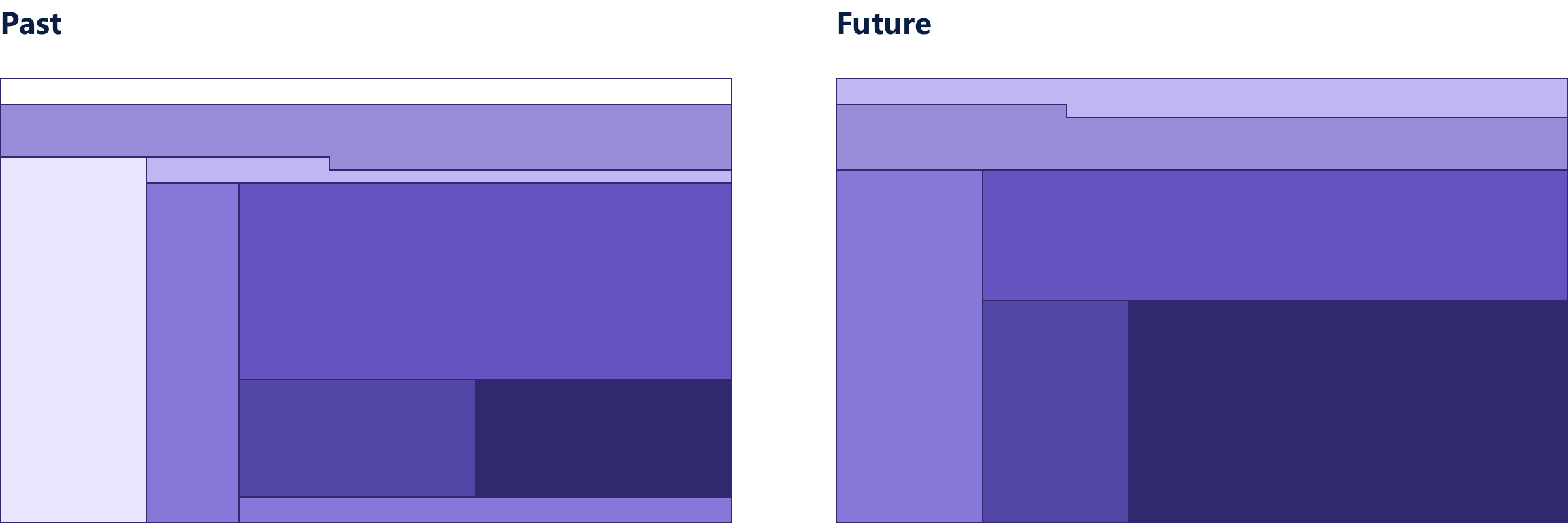
Here we can see a sort of “topological map” of the various UI panes, charting where we’ve been and where we’re going. As you can see, things were pretty cluttered before. We’re moving toward a more logical and simple layout with more room to review your code.
Familiar paradigms
Through testing and feedback, we learned just how much of a pain the bookmarks pane was.
- Many first-time users would struggle cloning or opening repositories.
- There wasn’t enough horizontal space to read the name of the repository in a narrow vertical layout.
- The bookmarks pane took up a lot of valuable screen space, but was seldom used once the repositories were open in tabs.
- The remote repository listing was disconnected and hard to find.
It became clear that repository lists needed their own dedicated experience. Because we were already using tabs, adding a plus button was a natural fit. If you’re familiar with how to open a new tab in a browser, you’re familiar with SourceTree.
A glimpse at the future
SourceTree 2.0
Coming soon

So what’s next? Here’s a look at where SourceTree is headed.
- The awkward footer tabs will be grouped in sidebar, like the Mac App.
- The committer info panel will be cleaned up.
- View options will be moved to the view menu.
- Density view options.
- We are exploring more ways to help you manage lots of repositories and stay up-to-date with outstanding push/pulls.
- Diffs will get nicer colors and layouts. 🌈 ✨
- If Build 2017 is any indication, we’ll replace all panels with transparent blurry “Acrylic.” (Just kidding)
As always, we’re listening closely to your feedback. Reach out on our community site and tell us what you think.