Engineering a darker SourceTree
By Brian Ganninger on July 17, 2017
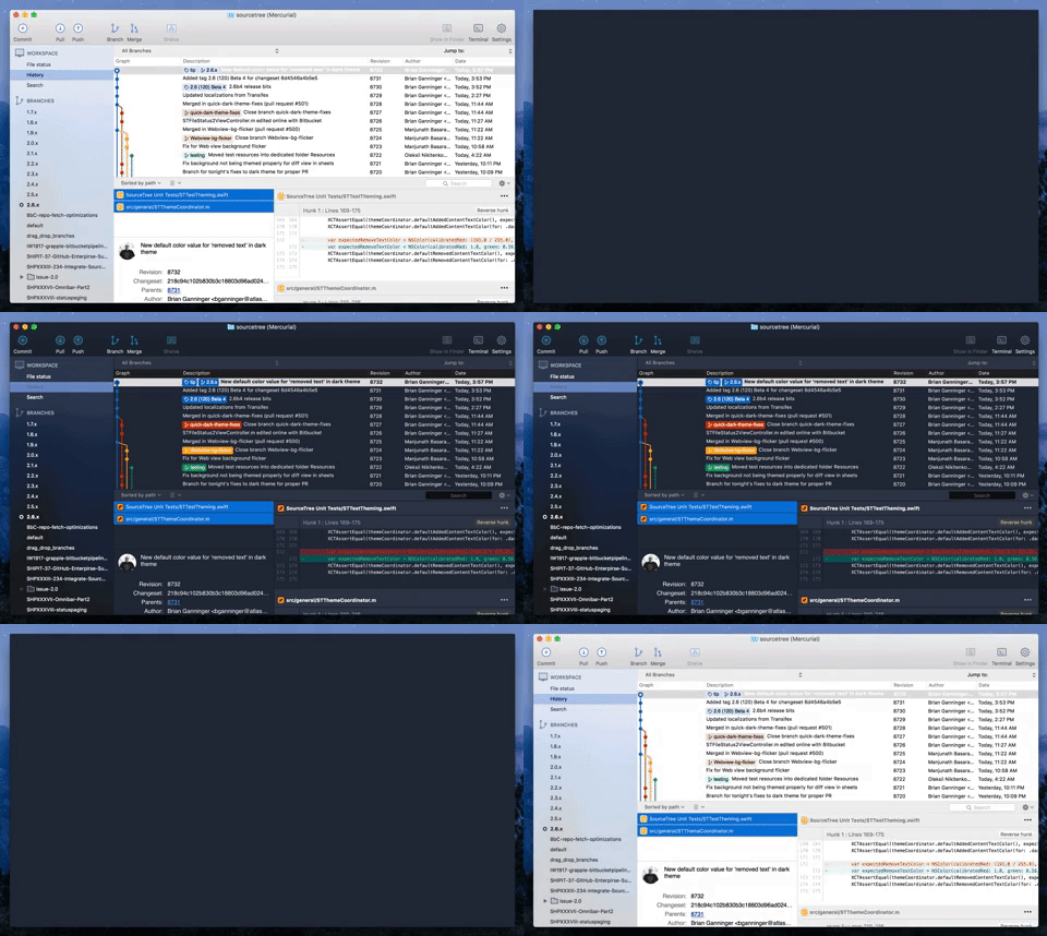
A “non retina-burning” update for SourceTree on macOS has been on our radar for a long while, and recently our senior designer Joel Unger came up with a mock-up on how it might look. We went back and forth on limitations and compromises (i.e. the old expectations versus reality phase) while exploring the concept during ShipIt, Atlassian’s well known hackathon. From there it then entered the development pipeline because even the worst compromise we’d found, potentially losing customization of the toolbar, wasn’t enough to deter 70+% of respondents to a quick Twitter survey.
Engineering Discussion
There are a variety of ways to implement dark themes on macOS. These range from the basic, applying an NSAppearance at the top level of a window and letting it cascade through stock controls like FaceTime, all the way through the ‘off-limits’ way by utilizing ProKit, a well known private framework used during my time at Apple that provided apps such as Final Cut Pro the ability to customize every element of their appearance. Our discussions focused on what limitations and compromises we wished to take, ranging from the use of color (black or tones thereof? custom colors?), how much content was themed, and deciding on how much custom UI to implement versus what options were available out of the box.
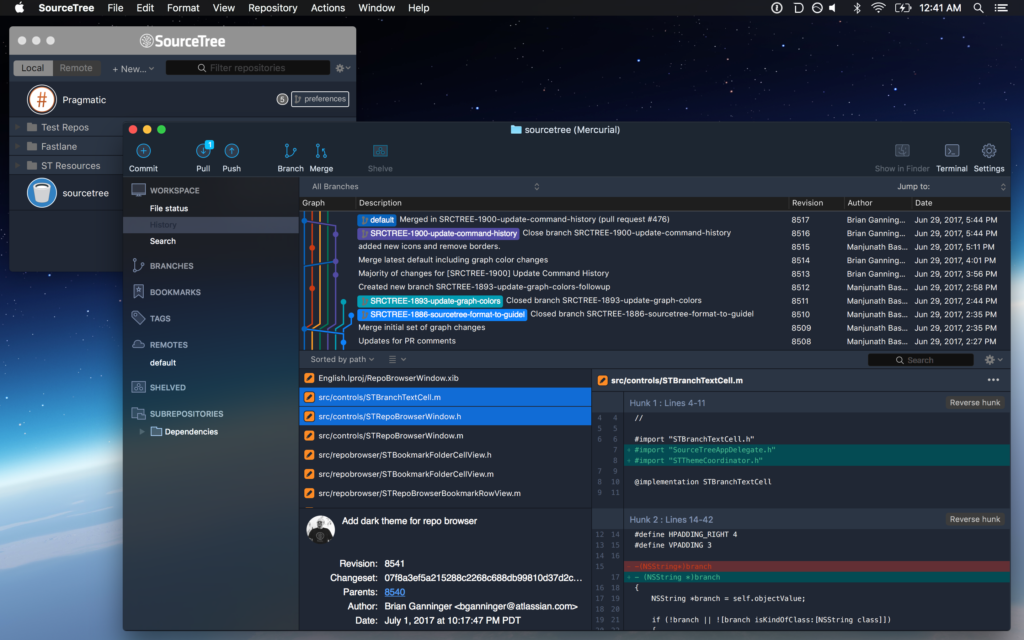
With the goal of offering the best user experience possible without saddling us with additional overhead in the future, we ultimately chose to use custom colors (midnight blue tones in this case) throughout, while maintaining all existing functionality with minimal custom UI. While it was the option that proved the most challenging to implement, we felt it would ultimately provide the best value to users by maintaining desired functionality present in the system by default versus other, more straightforward options available. We also decided to focus only on the primary windows a user interacts with rather than focusing on all windows and sheets throughout the app as it exponentially increases the size and scope of such a feature.
Taming the Beast

With the decision made, what did we change and how?
- color management: similar to ProKit, a theme coordinator provides a centralized location for colors which alternate based on either the specified theme or automatically for current theme. When changing the current theme this broadcasts it to allow elements to respond appropriately. This design has made it easy to iterate on the colors and assets with our designer while minimizing code churn and testable logic. When the time came to revise our branch color selection algorithm we also migrated it to theme coordinator, making it testable alongside the rest of the feature in our unit test suite.
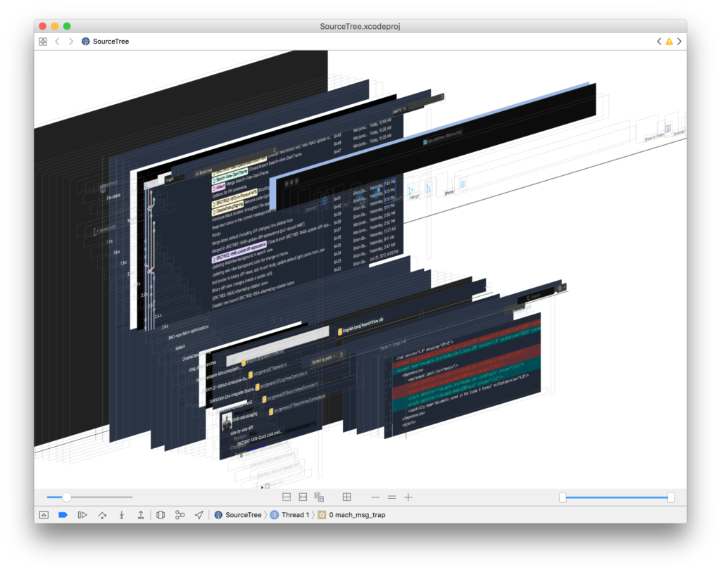
- window, toolbar: one of the first major hurdles was changing the toolbar and corresponding window chrome such as tabs. We use a standard NSToolbar with unified titlebar which supports a handful of themes from macOS and has a wealth of functionality including accessibility and customizability. macOS defines their NSAppearance under the covers in a manner similar to ProKit using bundles with compiled .car files. While there is an API to specify an arbitrary bundle for an appearance and additional ones that aren’t exposed in the system UI there is no guarantee as to their stability so we stuck with NSAppearanceVibrantDark or NSAppearanceAqua typically. Ideally the entire window would pick up the same dark blue tonal quality in combination with that. To accomplish this we ended up choosing the ‘vibrant dark’ appearance, which composites with a darkened blur and materials, and reverse engineering a color that worked with it. Once we’d found a proper color to composite it was a matter of finding where to make that change. In the debugger we were able to catch which layer(s) are composited against and then change accordingly as you can see in the above screenshot in a cauliflower blue.
- asset swapping: SourceTree uses a large number of images throughout the app from its vibrantly themed sidebar to the customized toolbar to file statuses and these need to respond properly, swapping to the theme-appropriate variant and ideally living in the Xcode-optimized asset catalog format instead of continuing the legacy of raw files in Resources.
- scrollers: the next major hurdle we encountered was theming scrollers – these have a default state, background, borders, and even a separate track when scrolling; each of these elements had to be teased apart and themed accordingly.
- the long tail: all those are just a few of the highlights that knocked out the first 80%… after that we had to start poking into the various nooks and crannies to get dividers, backgrounds of containers, customizable per-theme diff colors, buttons, and font colors just right. This is where the aforementioned view debugger really shined as it made it possible to visualize and navigate the disparate bits that composed a given area such as the multi-part diff view sometimes.
- … one more thing: our MVP covered the repo window that’s the lifeblood of developer workflows but it’s not the only one you might keep on-screen. To round out the experience we hopped onto the Repo Browser code as well and were able to leverage the prior work to quickly theme this window too, keeping your screen cool and consistent.

Living with Change
You can give the dark theme and corresponding revised light theme (both of which we consider beta) by downloading it directly from our website. Phased releases are beginning tomorrow in coordination with these “How It’s Made” discussions and we welcome your feedback to review and potentially incorporate in 2.6.1. We’re listening and want to make this the best experience possible as you switch SourceTree from day to night. 🌕🌔🌓🌒🌑
