By Brian Ganninger on October 7, 2019
Today we are deprecating a Sourcetree-specific portion of the Atlassian Account sign-in API and it will be unreachable after 16 Oct 2019.
One year ago we shipped an all-new onboarding experience in 3.0 for both Mac and Windows powered by a Bitbucket login in your default browser. Prior to that, in early 2018, we tweaked the in-app registration process on Mac to use a new endpoint provided by the Atlassian Account team to achieve a more seamless experience. We are now migrating users away from this individual endpoint as it will allow their team to deliver a better Atlassian Account experience overall.
Mitigation
- Download and install the latest release of Sourcetree for Mac.
- If you are unable to do so for any reason, download an applicable 2.x release and then perform the following steps in Terminal to setup prior to launching the app:
- run defaults write com.TorusKnot.SourceTreeNotMAS agreedToEULA2 YES
- then defaults write com.TorusKnot.SourceTreeNotMAS EmailHash DeprecatedEndpoint2019
- finally defaults write com.TorusKnot.SourceTreeNotMAS completedWelcomeWizardVersion 3
Impact
There is no impact to existing installations of Sourcetree for Mac.
The following Sourcetree for Mac releases will require mitigation as noted above:
- 2.7
- 2.7.1
- 2.7.2
- 2.7.3
- 2.7.4
- 2.7.5
- 2.7.6
Note: The registration and Atlassian Account portion of the Welcome Wizard will no longer complete after 16 Oct 2019.
To discuss this or any other Sourcetree topic please visit Atlassian Community.
By Brian Ganninger on January 17, 2019
Throughout the past year we listened carefully to all our Windows users and we’re excited to bring you the two most highly requested features in 2019! In this post we’ll take a sneak peek and provide visibility into what you can expect soon.
Dark theme
Our top request for Sourcetree for Windows is a “non retina burning” dark theme to better blend in with other developer tools. This became more acute when we debuted a dark theme in Sourcetree 2.6 for Mac over a year ago to much acclaim.
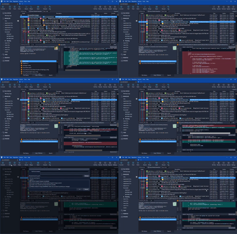
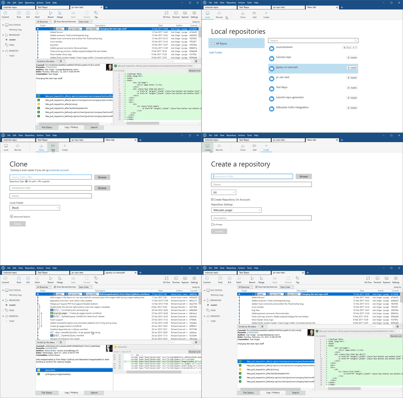
As you can see in the following demo, now every part of the Sourcetree for Windows UI is now rendered in cooler colors and the icons are appropriately swapped with either inverse colors or a cooler palette overall. Currently we’re iterating on the final colors, adding in appropriate settings, and overall polish.

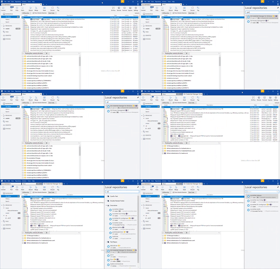
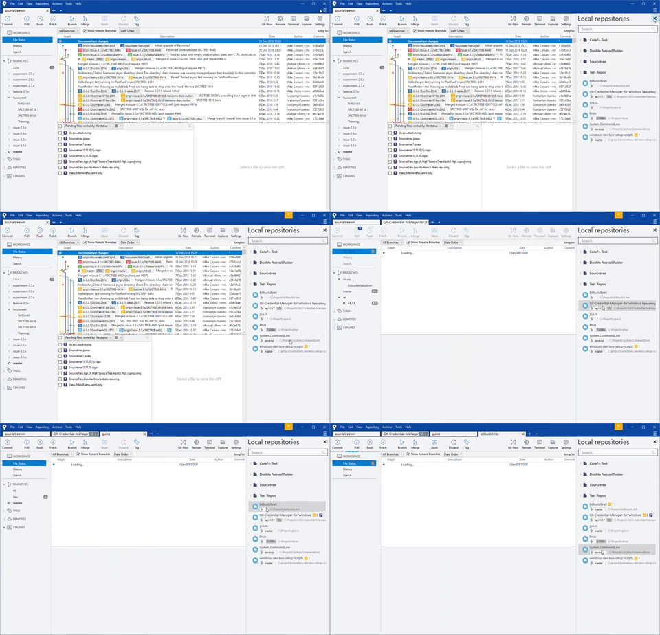
Repositories sidebar/split view
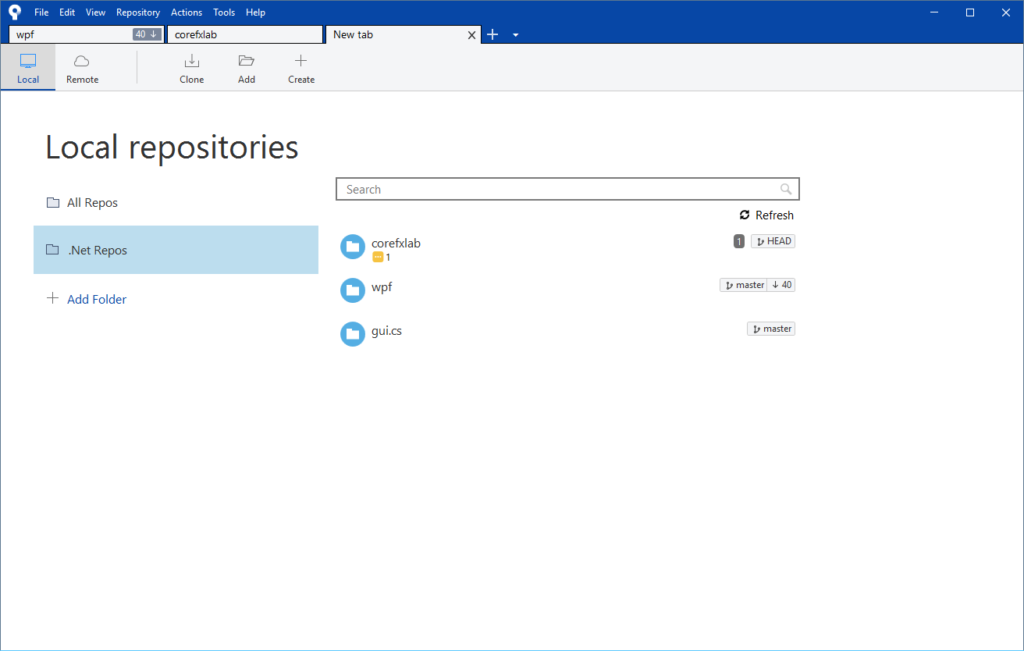
In the 2.0 release for Windows we simplified the UI complexity for both design and performance improvements based on app usage and user feedback. Part of that included replacing the sidebar – which contained a nested list of local repositories, provided an overview of their status, and provided quick access by mouse or keyboard – with what we call the “new tab experience.”

While well received in general we heard from some that they weren’t able to be as efficient with this new navigational experience. Since then the ticket for its return become our second highest Windows request. For many it remains a reason to stick with the last 1.9 release due to the potential for disruption.
Empowering our users and ensuring they have a pleasant development experience remains our foremost priority. To achieve that we explored many different options while working in hand in hand with our passionate users and we’re excited to share the results of that effort.


Coming soon
These aren’t just shiny demos though. While we don’t have a specific ETA to share right now for either of the features it’s safe to say you’ll see them released during the first half of 2019. We’ve already started sharing betas for the sidebar with our friends in the Sourcetree Beta Program to gather feedback and we’d appreciate yours too.
Join the Sourcetree beta program
By Kelvin Yap on August 29, 2018
power of Sourcetree lies in its ability to simplify how you manage changes to your in a visual way, whether you’re new to and trying to master the basics, or an experienced hand working with a team around a complex codebase.
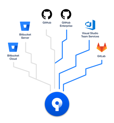
We also speed up your workflow by helping you interact with your repositories directly from Sourcetree with a seamless connection to in-house and remote hosting services like Bitbucket Cloud, Bitbucket Server, and GitHub.com.
With Sourcetree 3.0 for both macOS and Windows we’re proud to hosting services, namely

When you add an account from any of these new hosting services and your repositories you’ll get:
- SSH management: Sourcetree will generate and upload your SSH key (macOS) or manage directly via Putty (Windows) []
- Repository avatars: see the icons you’ve set to differentiate your bookmarks at a glance [if supported]
- Remote repositories: Remote repositories are viewable in an easily filterable list to manage and
- Repository creation: configure new repositories quickly and easily, setup for Sourcetree from the start [available features vary per service]
- Create pull requests: push the branch and then go directly to a new PR in the hosting service’s Web UI
- Single click access: jump straight to your current repository in its hosting service for advanced operations
Getting started with Sourcetree and your favorite services are now easier than ever. Sign in with a Bitbucket account (Cloud or Server) to register, configure an option or two, and you’re ready to go. You’ll be able to immediately clone a repository or you can visit the Accounts preferences section to add ones you use most often.
Sourcetree 3.0 for macOS and Windows is currently available as a beta, and will slowly roll out to users in a few weeks time. Download the beta today and let us know what you think via our beta mailing list!
3.0 Beta Downloads
By Mike Minns on April 24, 2018
The Sourcetree team are proud to announce an Enterprise version of Sourcetree for Windows aimed at organizations who run managed environments to install, update, and manage app installations at scale. Admins now have insight into who is using Sourcetree in their organization, and greater control over where and when Sourcetree is installed and updated, with no impact to the end user’s Sourcetree experience they know and love.

Installation and managed updates at scale
Utilizing Sourcetree’s new MSI file, admins can now install Sourcetree across their organization’s Windows machines using management software. It is now possible to specify the directory installs into and we’ve given greater control to admins in terms of managing updates to new versions of Sourcetree. And with the new ability to pre-configure Sourcetree settings for all users within their organization, admins can now get users up and running with Sourcetree in an easy manner and manage updates across all machines in one fell swoop.
Easier registration with Bitbucket Server and Data Center
For organizations that use , it’s easier than ever for users to register Sourcetree and get started by utilizing their Bitbucket Server or Data Center login. Users now have another registration option in order to use the product, reducing the time it takes to get up and running with Sourcetree.
Getting started
Simply head over to the and download the latest MSI to get started today. New releases of Sourcetree for Enterprise are announced via Atlassian Community. To be notified of new releases click on this link, select Watch and choose Articles from the dropdown. You will receive an email whenever we post a new update.
Download Sourcetree for Enterprise Windows
By Mike on February 26, 2018
We listened closely to all of your feedback about the pain points that remained in the 2.x release of Windows, and the resounding chorus was… performance, performance, performance! While we’d already integrated LibGit2 with great success it wasn’t a panacea. We knew we could do better but needed more data.

We began by adding the Process Log, which helps you clearly understand how Sourcetree is using Git and Mercurial. It can also help diagnose issues like long-running, orphaned or duplicate processes. It’s also for those who might be curious about how things work behind-the-scenes without opening Task Manager or a terminal window to dig deeper. Using this new utility we were able to identify and resolve a number of subtle bugs that were unexpectedly consuming precious computing resources.

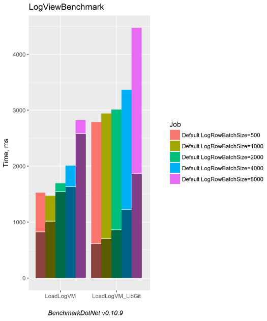
The heart of a repository lies in its commit graph. Another thing we learned, from both benchmarking instrumentation and the Process Log, was that submodule loading performance was slower with LibGit2 than calling out to the Git executable. We tracked down some issues that were responsible for these slowdowns; fixing them resulted in the dramatic 3 – 4x speed boost you see below; darker bars represent the improved times.


But wait, there more… we chose to use the Boost library as our benchmark because it contains over 100 submodules and were able to reduce the time it takes to scan for and show changes from 26 seconds to just 2 seconds. That’s more than an order of magnitude faster! Normally we’d put a gif of the difference here to demonstrate the impact but we decided to save you from an infinite spinner.
If you’ve ever seen the dreaded ‘Fetching Commits’ banner and felt frustrated as Sourcetree does a bunch of work – good news, it’s largely a thing of the past. The change sounds a bit logical when talking through it… any “jump” will now use the date of the commit as a reference point for loading. Now we can typically run a single command instead of continually loading our way to the selected commit with an unbounded number of commands. While both styles can be effective at loading the graph dynamically, especially given our performance boost above, we’ve eliminated any potential for it to be rather annoying to jump thousands of commits back in your history, instead responding nimbly regardless of your repository’s size or shape.

As a bit of icing on the cake we also improved the experience for tabs by reducing the time it takes a tab to first load by 100ms and more noticeably by adding a smooth animation when working with them.
We’re incredibly proud to share the 2.4.8.0 release with all our users to help them save countless developer hours and increase their productivity. Download it today from our website to enjoy one of the most stable, responsive, and performant experiences for Sourcetree on Windows to date.
Download SourceTree free
By Kelvin Yap on November 30, 2017
Modern software development practices like CI/CD and DevOps help the whole team be responsible for code quality. However, success in this environment depends on important information being accessible to everyone, instantly. Our Sourcetree team has taken this idea to heart in macOS by providing greater visibility into your builds, giving you more context and confidence in the quality of your code.
All you need to get started is a Bitbucket Cloud account, with Bitbucket Pipelines enabled, and you’ll be viewing the status of builds in Sourcetree in no time!
Let’s walk through how to make this happen.
Sign up for Bitbucket Cloud
Our Sourcetree integration with Bitbucket Cloud now provides visibility into the status of your builds.
Bitbucket Cloud is distributed version control, code review, continuous integration, and much more for software teams across the globe. Bitbucket Cloud includes free unlimited private repositories with nearly an hour of build time per month to enjoy built-in continuous delivery with Bitbucket Pipelines.
Step one of seeing build status in Sourcetree is signing up for a Bitbucket Cloud account.
For those with a Bitbucket Cloud account already, feel free to skip to the next section. If you’ve just signed up for a Bitbucket Cloud account, follow these instructions to import an existing repository of yours – you won’t be able to enable Bitbucket Pipelines and build without one!
Getting started with Bitbucket Pipelines
Bitbucket Pipelines empowers teams to build, test, and deploy their code directly within Bitbucket Cloud.
Here’s how to get your first build in your repository in 3 simple steps:
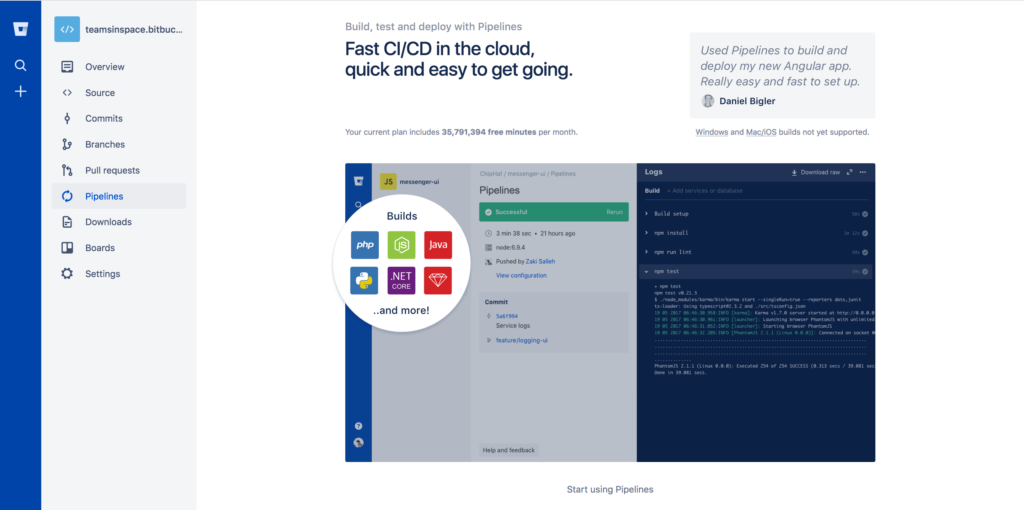
Step 1 Click the Pipelines icon, then click Start using Pipelines to access our language templates.

Note: Pipelines won’t work with an empty repository so you’ll need to add at least one file to get Pipelines building.
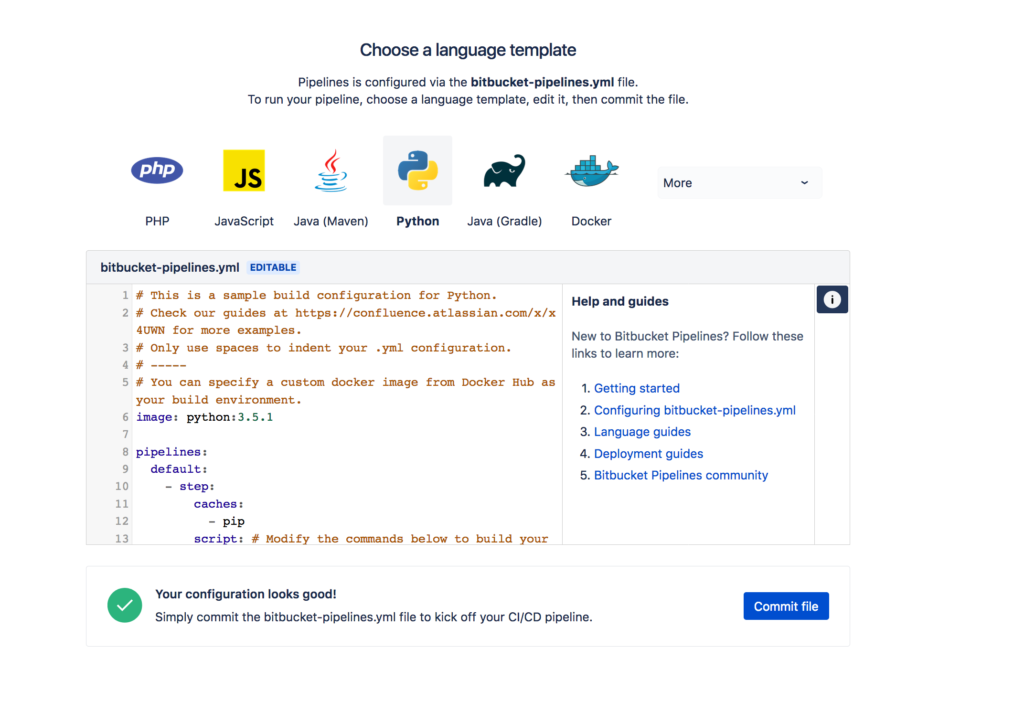
Step 2 Choose a language template and edit the bitbucket-pipelines.yml file which defines your build.

Step 3 Click Commit file and watch Pipelines start building.
If you don’t want to use the wizard to commit the file or you want to test the configuration locally first, check out this guide for more information.
Viewing build status in Sourcetree
Now that you’ve got Bitbucket Pipelines enabled in your Bitbucket Cloud repository, the last and final step to see build status in Sourcetree is to add the repository (or pull the changes) in Sourcetree.
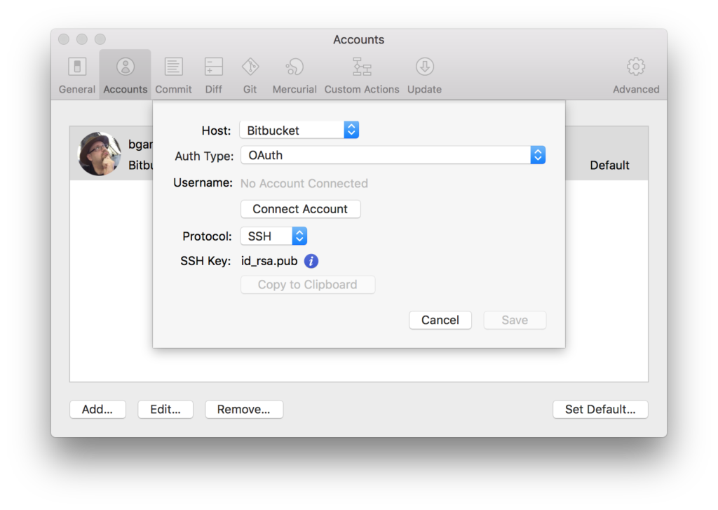
Step 1 Navigate to Preferences → Accounts, click Add, and fill in the details in the dialog.
Step 2 Open the repository you enabled Pipelines on from the Repository Browser, or by using Cmd + O to select it on disk.
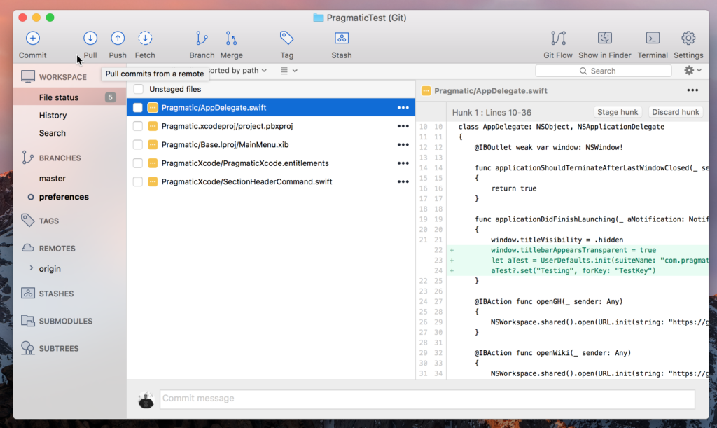
Step 3 Click Pull in the toolbar or use Repository → Pull… from the main menu.

And that’s it! You can now see the status of builds for a commit without having to leave Sourcetree. If you’re stuck at all head over to the Atlassian Community for some help getting up and running.
By Brian Ganninger on November 7, 2017
The best software development tools and stay out of your way as much as possible. They also provide all the context you need to get work done, removing the need to switch between tools to work out what’s going on or what to do next. Sourcetree is built to aid those new to distributed version control, like Git and Mercurial, as well as to provide advanced users a visual interface from which to work with their repositories. To greater awareness into your builds with the beta of our integration with Bitbucket Pipelines. Now build statuses appear in Sourcetree for macOS, giving you greater context and confidence in the quality of your code.
It’s a first for any Git or Mercurial client and we’re excited to share the fruits of our labor.

Build status at your fingertips
With modern software development practices, like CI/CD or DevOps where everyone is responsible for code quality, it’s important that information is easily accessible to everyone. Bitbucket Pipelines empowers these teams to build, test, and deploy their code directly within Bitbucket Cloud, and it was a natural fit to bring that all important information into Sourcetree for macOS. We’ve removed the context switch or two away from your workflow to see a build’s status within Bitbucket Cloud’s UI, and brought it from right where you commit.
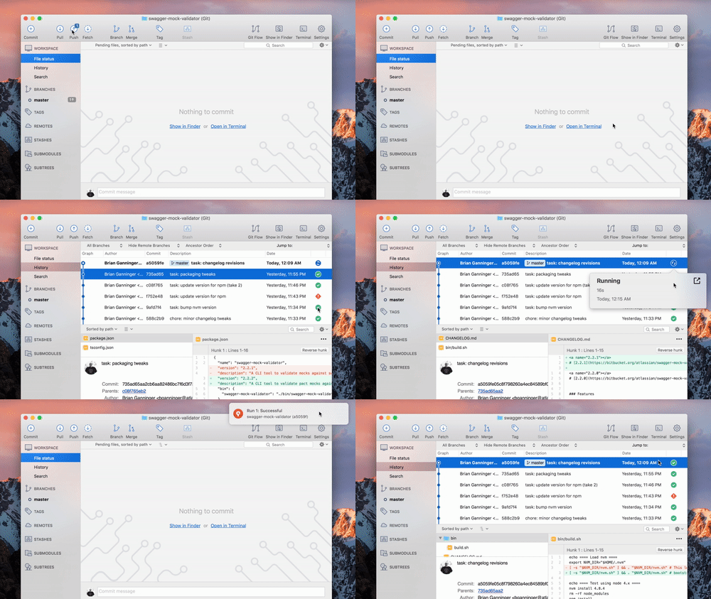
And best of all, Sourcetree utilizes notifications in macOS to update you when a build finishes, so it’s really one and done when you push a commit.

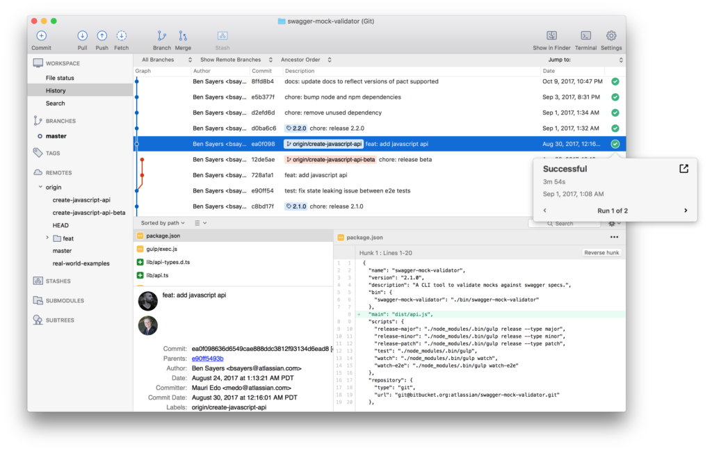
Sourcetree for macOS not only provides the same at-a-glance information about the most recent status and runs in your commit graph, you to peek into details for any of the runs associated with that commit. You only need to visit Bitbucket Cloud to dive into the specific logs for a run, and even that’s just a simple click away.
Get started today
The Pipelines integration for Sourcetree for macOS is in beta today, and will slowly roll out to users in the next release in a few time. We’re excited to help you improve the quality of your code and add vital context to your workflow. Download the beta, give the integration a try and !
Download the beta
P.S. Want to be amongst the first to find out about new fixes and features like this in the future? Be sure to join our trusted-testers mailing list.
By Brian Ganninger on July 17, 2017

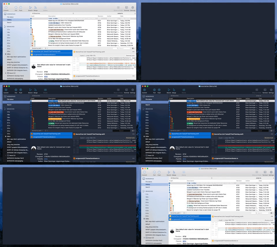
A “non retina-burning” update for SourceTree on macOS has been on our radar for a long while, and recently our senior designer Joel Unger came up with a mock-up on how it might look. We went back and forth on limitations and compromises (i.e. the old expectations versus reality phase) while exploring the concept during ShipIt, Atlassian’s well known hackathon. From there it then entered the development pipeline because even the worst compromise we’d found, potentially losing customization of the toolbar, wasn’t enough to deter 70+% of respondents to a quick Twitter survey.
Engineering Discussion
There are a variety of ways to implement dark themes on macOS. These range from the basic, applying an NSAppearance at the top level of a window and letting it cascade through stock controls like FaceTime, all the way through the ‘off-limits’ way by utilizing ProKit, a well known private framework used during my time at Apple that provided apps such as Final Cut Pro the ability to customize every element of their appearance. Our discussions focused on what limitations and compromises we wished to take, ranging from the use of color (black or tones thereof? custom colors?), how much content was themed, and deciding on how much custom UI to implement versus what options were available out of the box.
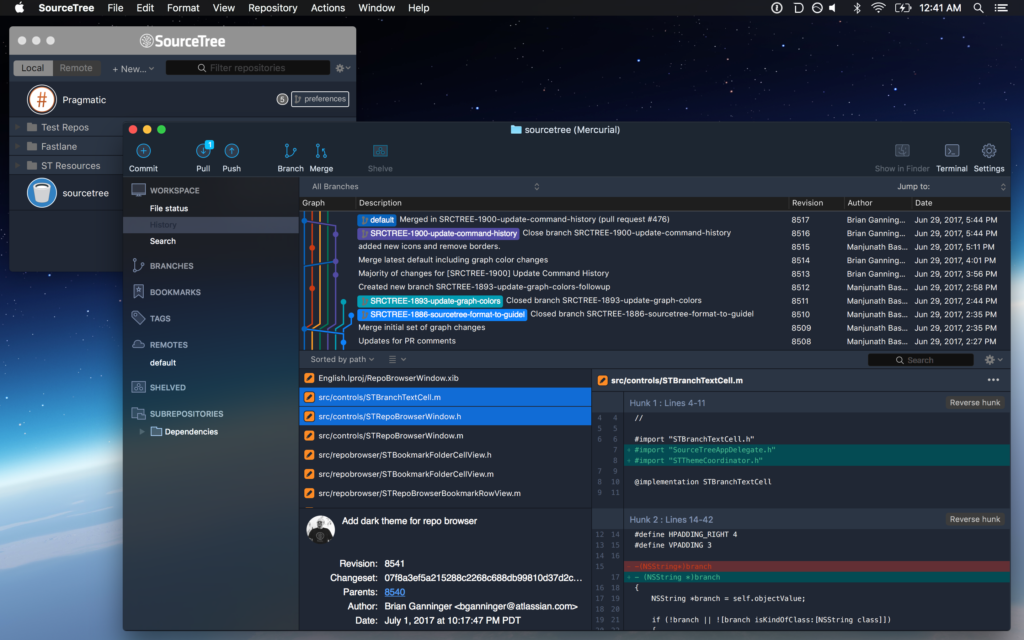
With the goal of offering the best user experience possible without saddling us with additional overhead in the future, we ultimately chose to use custom colors (midnight blue tones in this case) throughout, while maintaining all existing functionality with minimal custom UI. While it was the option that proved the most challenging to implement, we felt it would ultimately provide the best value to users by maintaining desired functionality present in the system by default versus other, more straightforward options available. We also decided to focus only on the primary windows a user interacts with rather than focusing on all windows and sheets throughout the app as it exponentially increases the size and scope of such a feature.
Taming the Beast

With the decision made, what did we change and how?
- color management: similar to ProKit, a theme coordinator provides a centralized location for colors which alternate based on either the specified theme or automatically for current theme. When changing the current theme this broadcasts it to allow elements to respond appropriately. This design has made it easy to iterate on the colors and assets with our designer while minimizing code churn and testable logic. When the time came to revise our branch color selection algorithm we also migrated it to theme coordinator, making it testable alongside the rest of the feature in our unit test suite.
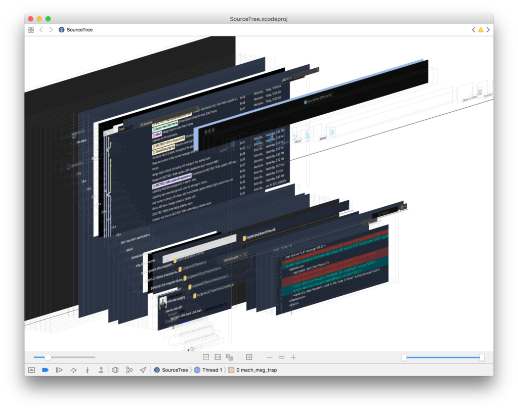
- window, toolbar: one of the first major hurdles was changing the toolbar and corresponding window chrome such as tabs. We use a standard NSToolbar with unified titlebar which supports a handful of themes from macOS and has a wealth of functionality including accessibility and customizability. macOS defines their NSAppearance under the covers in a manner similar to ProKit using bundles with compiled .car files. While there is an API to specify an arbitrary bundle for an appearance and additional ones that aren’t exposed in the system UI there is no guarantee as to their stability so we stuck with NSAppearanceVibrantDark or NSAppearanceAqua typically. Ideally the entire window would pick up the same dark blue tonal quality in combination with that. To accomplish this we ended up choosing the ‘vibrant dark’ appearance, which composites with a darkened blur and materials, and reverse engineering a color that worked with it. Once we’d found a proper color to composite it was a matter of finding where to make that change. In the debugger we were able to catch which layer(s) are composited against and then change accordingly as you can see in the above screenshot in a cauliflower blue.
- asset swapping: SourceTree uses a large number of images throughout the app from its vibrantly themed sidebar to the customized toolbar to file statuses and these need to respond properly, swapping to the theme-appropriate variant and ideally living in the Xcode-optimized asset catalog format instead of continuing the legacy of raw files in Resources.
- scrollers: the next major hurdle we encountered was theming scrollers – these have a default state, background, borders, and even a separate track when scrolling; each of these elements had to be teased apart and themed accordingly.
- the long tail: all those are just a few of the highlights that knocked out the first 80%… after that we had to start poking into the various nooks and crannies to get dividers, backgrounds of containers, customizable per-theme diff colors, buttons, and font colors just right. This is where the aforementioned view debugger really shined as it made it possible to visualize and navigate the disparate bits that composed a given area such as the multi-part diff view sometimes.
- … one more thing: our MVP covered the repo window that’s the lifeblood of developer workflows but it’s not the only one you might keep on-screen. To round out the experience we hopped onto the Repo Browser code as well and were able to leverage the prior work to quickly theme this window too, keeping your screen cool and consistent.

Living with Change
You can give the dark theme and corresponding revised light theme (both of which we consider beta) by downloading it directly from our website. Phased releases are beginning tomorrow in coordination with these “How It’s Made” discussions and we welcome your feedback to review and potentially incorporate in 2.6.1. We’re listening and want to make this the best experience possible as you switch SourceTree from day to night. 🌕🌔🌓🌒🌑
Download SourceTree free
By Brian Ganninger on June 8, 2017
Many macOS apps like SourceTree are distributed outside of the Mac App Store . Using Sparkle, SourceTree pushes out updates to all users simultaneously whenever the
file is updated. While suitable for its intended purpose, these days many web services favor rolling out updates to groups of users in an incremental fashion, providing a safety valve for issues not found during testing or that crop up unexpectedly. Smoother releases were something our team wanted to implement in order to minimize impact these issues can have on the entire user base. The team explored options and ultimately decided to build our own utilizing Sparkle and fastlane, and we’re proud to announce the open sourcing of the code that progressively rolls out new updates for SourceTree.
What’s in the box
From the beginning we sought to have a minimal footprint for these changes, delivering the functionality we wanted with minimal disruption. Each component is easily digestible and ready to be tweaked for your needs. While written in Objective-C it works just as well in Swift via bridging – in fact, the demo app and all unit tests are written purely in Swift!
- PRGUpdateHelper – the primary class encapsulating randomized group management logic
- PRGGroupPercentageTransformer – simple transformer for mapping group numbers → logical percentages
- NSString+PRGHashing – simple category for generating a SHA1 hash
- ProgressiveUpdater (demo app) – a small app that demonstrates how to use the class and visually verify results
Once the client was aware that multiple feeds available we needed to make sure the appropriate feeds were actually there. We were already using the equally well-known toolset, fastlane, for distributing our builds (along with several other tasks) so it was natural to take advantage of its richness.
This project includes a distilled version of our . Default lanes such as alpha and beta generate builds tailored to those updates and there’s now one called custom which provides one-off builds for testing that disable updating. The star of the show is the update lane which takes a percentage and builds the appropriate deploy artifacts for uploading to your server. When brought together these lanes make it efficient to manage testing across a range of options and ensures a smooth rollout to your users with minimal fuss.
Airbags aren’t optional
We implemented phased releases in SourceTree because of substantial, potentially disruptive changes that were underway in the 2.4 release. We added OAuth 2 authentication and an SSH Helper to make setup simple and easy, but complicated challenges around topics such as these have the potential to create problems despite good intentions. We released 2.3.2 in late October with the phased release functionality baked in and, in early December, we started rolling out 2.4 to an increasingly large group of users based on the timeline we discussed previously.
Is it working? Absolutely. We’ve had a manageable flow of reports coming in through our various support and bug report channels along with monitoring comments on Twitter and elsewhere to follow up with users encountering problems. These reports have been invaluable in hardening 2.4 for general consumption. . Rather than cause a large amount of churn for everyone, we’ve now got an additional airbag in place beyond our Trusters Testers beta group that provides a bit more peace of mind for users and breathing room for us.
In the end we hope others will benefit from having these resources at their disposal. If you’re updating your app outside of the Mac App Store you should definitely check it out. There’s a public Git repo available via our Atlassian Labs group on Bitbucket that’s a quick clone away, and it’s the same code used in SourceTree today. We encourage you to file bug reports and feature requests via the repository’s public issue tracker and pull requests are always welcome!

Upgrade your updates today!
By Joel Unger on May 18, 2017
.
A proper home for tabs

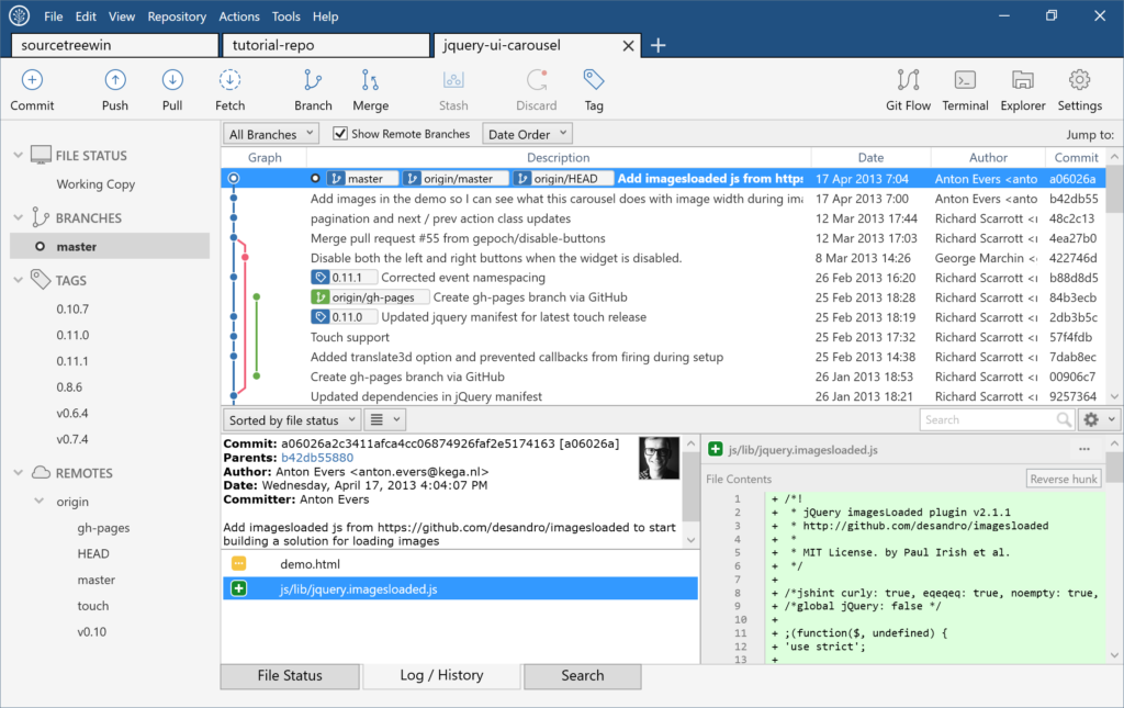
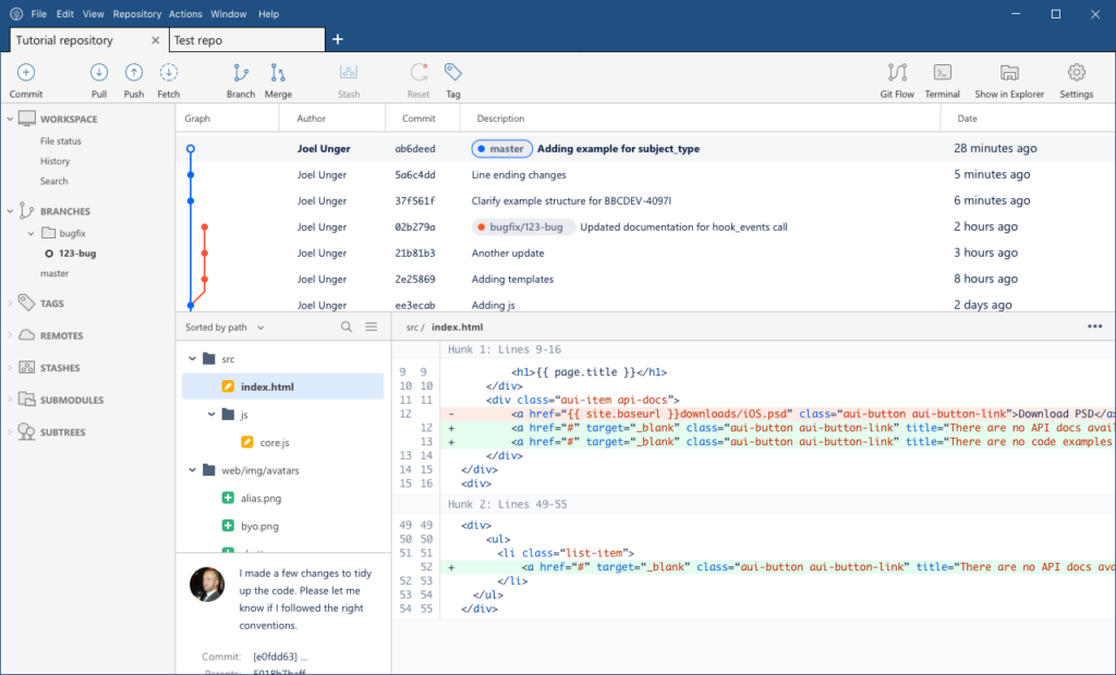
The Windows App always used tabs for navigating between open repositories, but we knew that those tabs weren’t quite right. The toolbar sat above everything else in the UI, but it only really belonged to the open repo (tab). We’ve swapped those panels so that tabs now live at the top of the hierarchy, much like browser experiences that you are no doubt familiar with.

Here we can see a sort of “topological map” of the various UI panes, charting where we’ve been and where we’re going. As you can see, things were pretty cluttered before. We’re moving toward a more logical and simple layout with more room to review your code.
Familiar paradigms

Through testing and feedback, we learned just how much of a pain the bookmarks pane was.
- Many first-time users would struggle cloning or opening repositories.
- There wasn’t enough horizontal space to read the name of the repository in a narrow vertical layout.
- The bookmarks pane took up a lot of valuable screen space, but was seldom used once the repositories were open in tabs.
- The remote repository listing was disconnected and hard to find.
It became clear that repository lists needed their own dedicated experience. Because we were already using tabs, adding a plus button was a natural fit. If you’re familiar with how to open a new tab in a browser, you’re familiar with SourceTree.
A glimpse at the future
SourceTree 2.0

Coming soon

Here’s a look at where SourceTree is headed.
- The awkward footer tabs will be grouped in sidebar, like the Mac App.
- The committer info panel will be cleaned up.
- View options will be moved to the view menu.
- Density view options.
- We are exploring more ways to help you manage lots of repositories and stay up-to-date with outstanding push/pulls.
- Diffs will get nicer colors and layouts. 🌈 ✨
- If Build 2017 is any indication, we’ll replace all panels with transparent blurry “Acrylic.” (Just kidding)
As always, we’re listening closely to your feedback. Reach out on our community site and tell us what you think.
Download SourceTree free

