
SourceTree Design – what’s next?
By Joel Unger on March 1, 2016Our goal with SourceTree is to move towards a cleaner, simpler interface for developers new to Git while keeping all the powerful features advanced users love. The last release was a step in that direction. We’re excited to share with you our future plans, but first let’s take a step back and look at how far we’ve come:
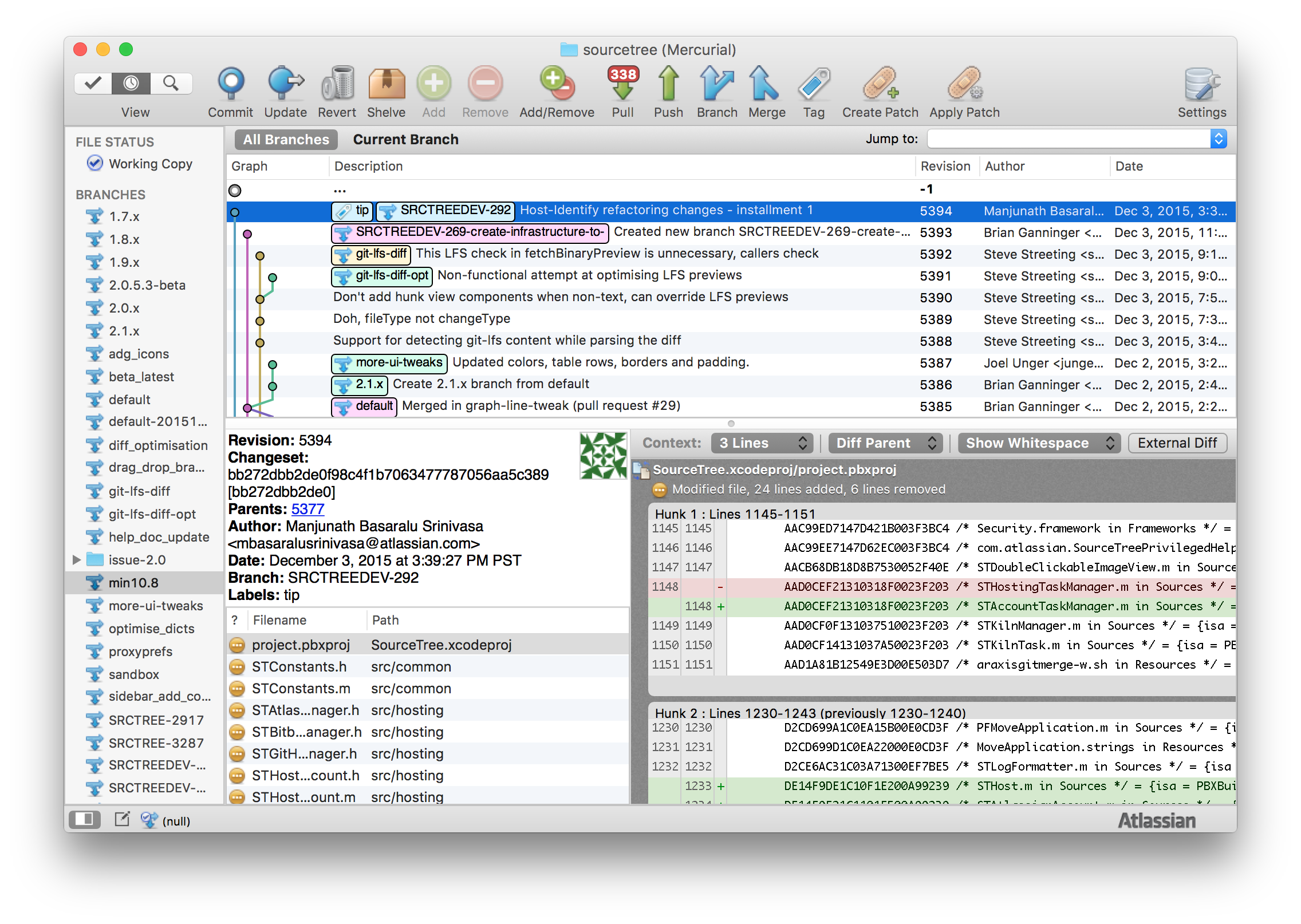
SourceTree in 2012
SourceTree in 2015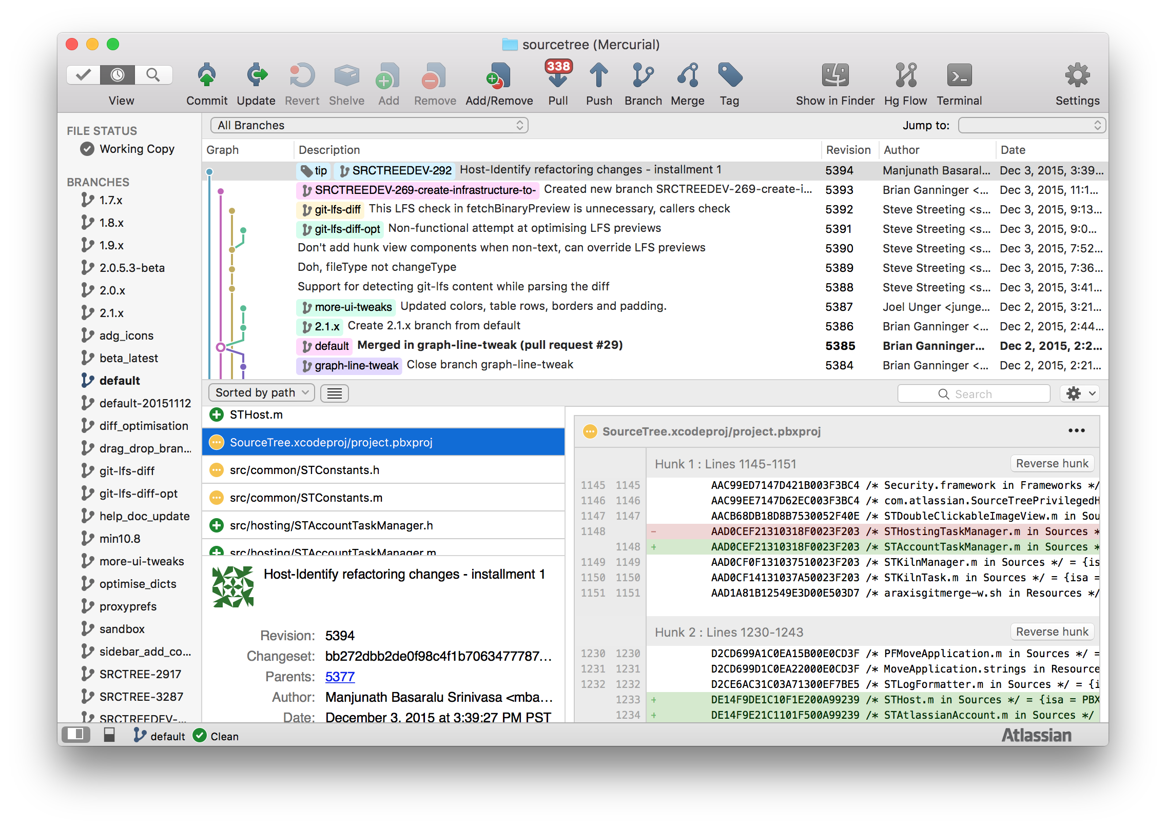
We’ve made huge strides in improving usability and UI consistency throughout SourceTree, but we’re just scratching the surface.
Addressing approachability and “interface bloat”
There’s no doubt that Git has a steep learning curve. SourceTree has always helped by offering an excellent visual counterpart to the command line interface. We don’t “dumb down” Git, but we believe we could do a better job of making SourceTree more approachable for new users.
Many SourceTree users asked us to tackle SourceTree’s “interface bloat”. One way we tackled this problem was with data. By thoroughly looking at the click data, we found a set of buttons that were rarely used in the toolbar. We surveyed roughly 180,000 unique users and found that the “Reset”, “Add”, “Remove”, “Add Remove”, and “Git Flow” buttons, each individually, were used by less than 5% of those surveyed. So we created some new mockups without these buttons in the UI and tested these mockups with our existing users for over six weeks. They loved it!
Don’t worry, we did not remove any functionality, all of those options are still accessible via right click and the “Repository” and “Actions” menus.
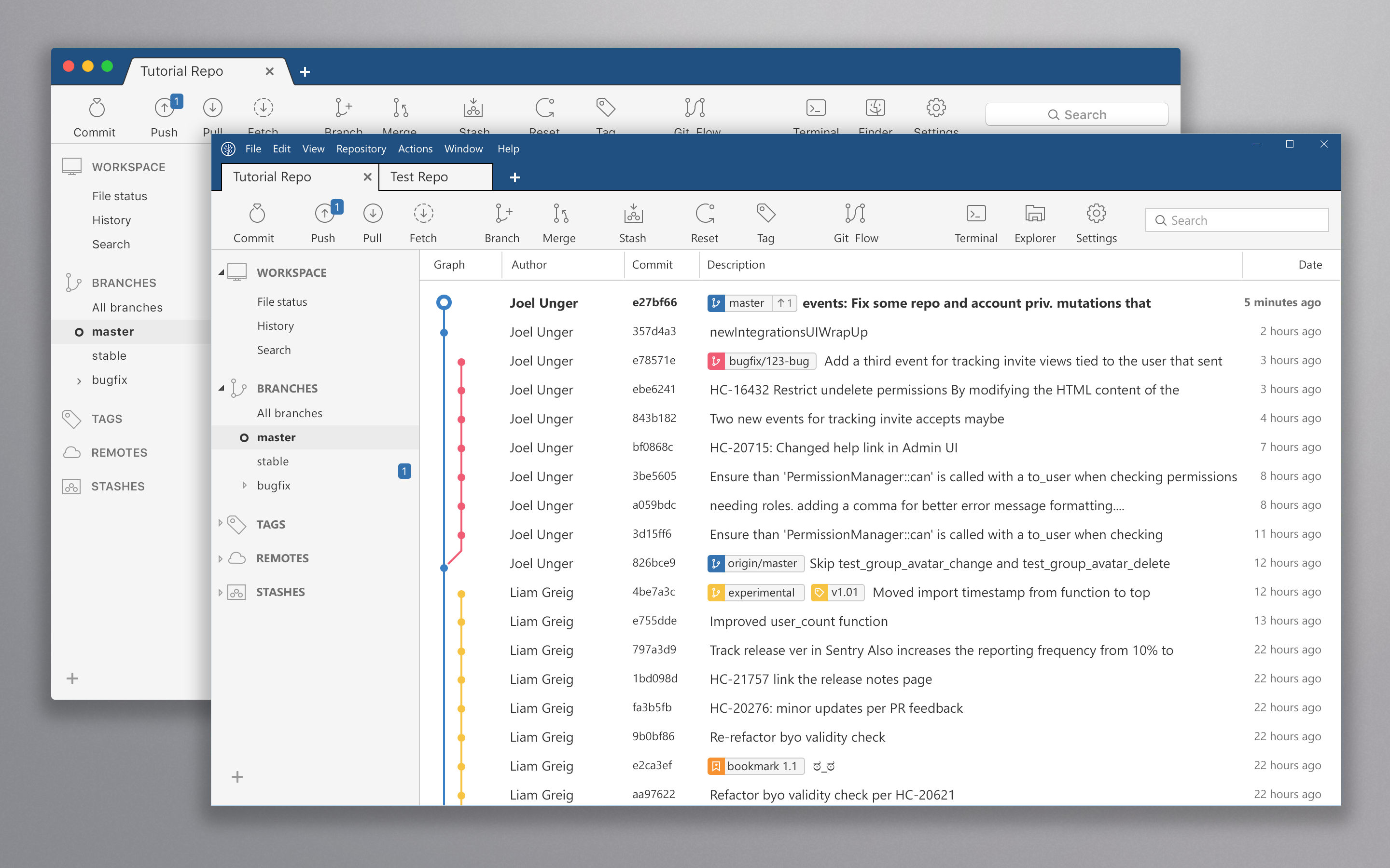
Modern design across two platforms
We’re trying to make SourceTree for Windows as beautiful as the OS X App, and we finally approached a point of convergence. Windows users – we promise that a bright future is ahead. Here is a sneak peek:
Want to see more? Grab some time on our calendar and give us 1:1 feedback. Looking forward to speaking with you soon!

80 Comments
Hey, Atlassian editor-in-chief here… Regular readers may notice that we’ve changed how we do comments on the SourceTree blog. Here’s what’s up.
Unfortunately, a few readers recently left comments that were downright offensive. Those comments have been removed. But we don’t want that kind of thing on our blog at all. Even for a few minutes. So for now, comments will go through an approval queue before they appear here.
We’re eager to hear your feedback – both complimentary and critical. So be real! Just be cool, too.
Why don’t we see any comments the last month. Is the approval queue not actiely maintained?
What was wrong with the moderation features of Disqus? Like the recent requirement to have an Atlasssian account to use SourceTree, the change in commenting systems just seems like another information grab by Atlassian.
OS X has a wonderful feature of customizable toolbars. Why don’t you put buttons like “Git Flow” there? Those 5% of users will add buttons back manually.
Thanks for reaching out! We added Git Flow to the optional button set in version 2.2.1.
Looks quite good actually, where is the repo switcher though?
What you call a clean UI, I call useful information buried in additional clicks. While you claim UI/UX improvements, you break cardinal UI/UX rules such as having the “Atlassian Blue” window header on OSX. And the biggest failure of all, checkboxes that cause information to move (git working tree to index).
One only has to look at other areas of Atlassian, such as BitBucket, to see that the developer culture there seems to now be permeated by web designers more concerned with form over function. The number of bugs in recent releases also seems to indicate a lack of developer experience, testing, or both.
I hope this isn’t considered too “offensive” for moderators that claim they welcome criticism as well as praise.
I fully second that:
the thing with the checkboxes which immediately moves the file to / from index is not really intuitive. The previous method with select and then move by drag/drop, contextmenu or stage – button was by far better. It might be better to use checkboxes to mark the selected ones (instead of a simple selection)
I also think that moving e.g. “amend commit” to a dropdown is also a step backwards.
James R – Not at all! This is exactly the kind of constructive feedback we need to make SourceTree – and all our products – better. Thanks for chiming in.
James R – I won’t bore you with the details, but we were having trouble with moderating via Disqus and switched back to the blog’s native comment system for the time being. We may bring back Disqus once that’s all worked out, though.
It would be nice to have the ability to theme/skin the UI at the user-level. It would also alleviate some of the “but I don’t like look X” reactions, as it would all be configurable.
Great feedback. Thank you!
Can you please show a screenshot that shows the diff view and commit details, basically the bottom half of the current split view. Also can we get the summary line in the diff view back, the one that says “24 lines added, 6 lines removed”, it disappeared in the 2015 version.
We’ve got a few prototypes that we can share with you. Are you free to chat in the next couple weeks? Here’s a link to my calendar: https://calendly.com/rchhabria/sourcetree. Thanks.
Looks great, definitely looking forward for some fresh UI. The commit tree in the Windows sneak peak looks great!
It wasn’t mentioned in the post, but some improvements in the performance area wouldn’t hurt too. 🙂 Thanks for your work!
Also can you confirm that we can finally get force pushing and squashing in the Windows version?
Hey Stan – We’re looking into it.
The UI refresh may have enabled you to roll out updates across all platforms more uniformly, but it was by no means something that most people I interact with asked for.
Simple additions like being able to force-push from the UI would have given us more excitement.
The way you do interactive rebase is unintuitive and does not carry over well to how the command line does it. For example, you order items from newest->oldest, whereas command line is oldest->newest in the TODO file. Also doing different combinations of picks/fixups/edits/etc cause problems because you do not handle all of these combinations of cases in your UI flow.
I personally use the command line tooling for everything. I work much quicker that way. I realize it isn’t for everybody, but you really shouldn’t claim to not “dumb down” git, because that’s what you’re unavoidably doing.
After a year of using SourceTree, my team is not having an easy time understanding rebases and submodules. I argue that using the command line helps to intimately understand how Git functions. Submodules are a perfect example. SourceTree blindly assumes you want to run `git submodule update` any time a branch checkout occurs. This is wasteful and confusing, because for one people are confused about what detached HEAD is. Second, it makes the process take longer. Depending on what I do, I may not need the submodules to recursively update. This makes me work quicker in the parent repositories.
Since you bundle multiple git commands together, you are indeed “dumbing it down”. This does not help users understand what git is actually doing. All they see is some abstract operation that SourceTree provides, without fully understanding the implications of how it impacts their working copy.
Usability and performance have been CONSTANT and ONGOING problems with SourceTree. However, instead of addressing these usability issues, you “fixed what wasn’t broken” by doing a UI revamp. Not only that, I argue you made the UI more difficult to use. I just don’t see the value in your changes. You market it as a great thing based on user feedback, but everyone here sees that you did not address feedback at all.
Thanks for your comments. We meet with our users every week and get feedback using clickable prototypes. Please sign up below (or use this link: https://calendly.com/rchhabria/sourcetree) to be a part of those design studies.
I am switching to GitX-dev (https://rowanj.github.io/gitx/). It’s very similar to SourceTree and the GUI design is well thought. I may come back to SourceTree when its GUI gets better.
The “2012 vs. 2015” Mac screen shots illustrate, in zero words, a few UI regressions that I and others have reported in the past:
1. Loss of the row delineations in the table views. The stark pools of white that now dominate the window (especially in full screen on a large monitor) make the interface not only harder on the eyes (too bright) but also difficult to track the rows from left to right, especially when there are a lot of them.
2. Loss of the hunk diff summaries (e.g. “n lines added, n removed”). This is very useful information that we now have to go to the command line for.
James R. also covered the insane “check boxes that behave as command buttons and make everything jump around” problem, for which no cogent response has been offered.
Just a few examples of steady erosion that’s taken place since version 1.8 or so.
b
This. The amount of users who are complaining about the disappearence of color from the interface is MASSIVE, and will hopefully prove too strong for Atlassian to just ignore, although they’re doing their best. Literally hundreds of users have indicated their dissatisfaction in the forums, and a very large number has downgraded to avoid the new changes.
Since Atlassian seems determined not to drop the new UI style, at least acknowledge that far from everyone agrees with the path you’re taking. Give users the option to keep the old look.
Reading over this blog post again, it’s clear that the focus of the SourceTree team is how the product looks instead of how well it works and conveys useful information. Just look at the over 500 verified and open bug reports in Jira for the SourceTree (Mac) project, and you know there’s a huge quality problem.
The 2012 UI may have been “dense”, but it packed a lot of information at a glance, with utility only a click away. The 2015/2016 UI is a essentially a web page. It wouldn’t surprise me if SourceTree is eventually released as a mobile application; perhaps cool to some, but near useless for dev actually trying to get work done.
I have no problem with the idea of “refreshing” the UI and starting with a minimal set of icons on the toolbar, as long as the user can add them back. However, even this has been botched, IMO, by the ST team. Examples: The choice of low contrast colours for file status icons, vast amounts of white space, wasted vertical space, silly grid separator lines over banded rows, and now toolbar icons that look like wireframe placeholders.
It’s really sad that this has happened to SourceTree, as it was once the best GUI client for Git and Hg, on OSX anyway. It still has some features that competitors lack, but as those competitors catch up, and the bugs in SourceTree pile up, more and more of us will leave SourceTree behind.
fully second that. And I see not adequate consideration of such comments in Attlassian’s replies.
That was supposed to have been a reply to Eric McCormick’s comment about a skinning/theme option, which I wholeheartedly support.
Sorry, but I find that disingenuous. You’ve made a change that clearly a lot of users are unhappy about. Now you’re adding comments to a moderation queue which clearly will let you filter what does and does not get through.
There’s nothing to stop you letting mostly positive comments through and then 1 or 2 negative comments to show perceived balance.
I am an adult, I’m sure 99% of people on here are too. We’ve all heard certain words before, and most probably have used them in robust debate and discussion in the workplace. I can read those comments and not blush or be offended.
If you look through the comments already there are less than a handful negative and mostly positive. If you look at your answers site there is 95 negative and only a couple that praise the new design.
You’re right, Chris: there’s nothing stopping us from throttling the number of critical comments that appear here. I’ll say that we’re not (‘cuz we aren’t), and hope readers are willing to take my word for it.
Please understand that profanity isn’t the litmus test for what counts as offensive. The words “fuck” and “bullshit” even appear in our company values. If you go back to previous blogs, you’ll see there are plenty of comments with profanity that are still visible.
Respect for our staff, user community, and humans in general is the issue. We don’t tolerate comments that put down the mentally disabled, people with cancer, or any other group. Hopefully that flavor of comment is a past-tense thing now, and moderating will be temporary.
Cheers,
-S.
“What’s next?” – A Linux port, please!
How about to add again, on Toolbar Customization, the “Patch” button?
I used it a lot for quick and dirty patchset to production, now I have to go to the menù (and the item, unfortunately has no keyboard shortcut) and select the action.
Thanks for letting us know!
Please remove the requirement to login, I still can’t use the new SourceTree in my dev enviroment with no Internet.
I love the new uniform UI and having tabs on mac! but while implementing it please do not forget the #1 missing accessibility feature.. font size option!
I have near perfect sight but still I’m having trouble reading commit logs in 2560×1440 monitor..
having individual font sizes can be difficult to test in the UI but at least have a “large” option please.. thanks!
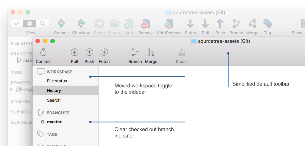
I want to contradict to “Clear checked out branch indicator”
Have a look at my example: http://i.imgur.com/xj5g2H7.png
* Removing the statusbar removed an easy-to-find indication of the current checked out branch
* Introducing a separate icon for the checked out branch within the log-view – instead of the previous overlay icon – makes it immposible to see whoch branch is checked out, if you have multiple branches on the same commit. The new indicator indicates the current checked out COMMIT rather than the current checked out BRANCH
* If you have your “folders” collapsed within the branches panel, its not possible to see the checked out branch in the branches panel. Even worse: if you have deeply nested folders (i.e. complex branch names like “My/version/1/2/5” you have to open each folder to find the checked out branch name (if you don’t know the branch name …)
* as the bookmark list ist completly independent of the displayed repository, you cannot easily identify your current repository within the bookmark list – unless the bookmark list shows the checked out branch …
Conclusion:
=> You only seem to use very simple situations while testing your GUI (simple branchnames, only a few bookmarks) – and not complex usage (quite a few bookmarks, lot of branches, complex branchnames). Else you would have noticed that your assumption of a “”Clear checked out branch indicator”” is complete nonsense …
Thanks for the feedback and screenshot! It’s really helpful!
First, I’m glad that ST development is catching up again, and that you are working hard to resolve the biggest issues.
That said, I’m not happy with the way ST is going. I feel that the latest changes are a step back, and I’m having a hard time adapting to the new interface.
1. Monochrome icons make it way harder to differentiate between them. For me, color is _the_ most important factor to easily recognize an icon. Taking them away makes it harder to find them, and I have to read the text under each icon every time I’d like to use them.
2. The same goes for the icons in the repositories sidebar (where the branches, remotes etc. are shown). They are just way to similar to each other.
3. In the diff view, it’s not possible to select consecutive lines with SHIFT anymore. You can select non-consecutive with CTRL, but SHIFT doesn’t work. It is possible to just click and drag the mouse, but doing it too fast results in missing lines (e.g. only every second line is selected).
4. It feels like the repository view on the left got way more crowded. There’s too much information with too less whitespace, and the icons are confusing. I don’t want to look at the sidebar anymore, because it stresses me out.
These are just the main points in the 1.8 update which really grind my gears so to speak.
I feel like I need more and more mental capacity while working with ST, and it get’s in my way more often than helping me do my work (while it should be the other way round, obviously).
Thanks for your comments. Would you like to participate in some design studies? If so please, sign up below or use this link: https://calendly.com/rchhabria/sourcetree.
I really like the drafts for the new UI design. Tackling the interface bloat is something what helps some of our employees which rearly work with git, but have to sometimes, a lot.
Thank you!
You promised this already long time ago – but nothing happened.
You still seem to be stuck by your preference for the MAC-Version vs. subordination of Windows. I already had a discussion about this on https://answers.atlassian.com a long time ago – with a few promises and nothing happened (Cannot find the discussion yet – due to a bug in Atlassian Answers )
Even your blog article shows the precedence of Apple: only SourceTreeMac-Screenshots – no SourceTreeWin Screenshots.
Might be your design changes make sense on MAC – but they seem not to be transferable 1:1 to Windows …
I don’t like the “hours ago” display type on the date column at all. Depending on what you do it is quite a hindrance. Please make it possible to change back to actual time and date.
Also I wish I had that option in BitBucket too.
Regarding the Commit, Push, Pull and Fetch icons. The previous version of these icons were all distinctly different. A green arrow into a blue circle, an up arrow a down arrow and a broken line down arrow. These were visually distinct. Now at a glance the first thing my eye sees is just a circle for commit push and pull. The broken circle is at least as visually distinct from push/pull as the broken line arrow, so that’s not so bad. I have to look again to see the visual distinction. And the commit icon looks like a diamond ring. What is up with that? I would recommend taking another look at these four icons. Also, I just don’t like the homogeneous look of the whole toolbar is just pleasing to the eye. I still think it needs some color to break it up.
On the plus side, the branch, merge and stash icons look nice, though I would still advocate for some color. The stash icon is much better than the old one. Reset and tag are good too, but less used by me. I don’t use the other icons at all (settings on the rare occasion), so I would like to be able to remove them from my toolbar.
The side bar looks much better, though I still advocate for color on the icons.
The main window looks really nice.
The new unified interface looks amazing. Can’t wait to test it!
Fast repo switcher is the feature i’m looking most forward to. Those tabs in the windows prototype gave me some hope, but please bring ’em on the Mac version too!
Hi guys – first off thanks for detailing the direction of the product.
It’s interesting to see and the transparency allows your users more early feedback in the process.
As an aside to visuals, there is still quite significant issues with the 1.8.x series, including this ticket:
https://jira.atlassian.com/browse/SRCTREEWIN-4325
It was marked as resolved but is still a major issue, and is blocking a number of people at the moment from using ST in an effective way.
I have left numerous comments on there, since it was “Resolved” but no one from the team has jumped on to indicate these comments are being looked at or received.
Should I create a new issue?
Thanks,
Josh
Hi Josh, We just released version 1.8.2.11 for Windows. Please let me if the latest version fixes your issue. No need to create a new ticket. I’ll follow up with the team in the morning regarding it. Thanks for reaching out.
Make a new fresh looking UI is a great idea. However I can’t get a modern trend of making everything gray. I don’t want to offend anybody, but it looks like designers become color blind. I still don like Apple turning every UI element to gray. I use XtraFinder to get back color icons in Finder, as it’s really hard to distinguish all-gray icons. It’s the same when you try to recognize a person or an object in twilight.
Also your shade of gray seems to be a bit different from one Apple uses in Mac OS X apps (iTunes, Safari), so icons look like disabled to me.
As for “improving usability”. There’s nothing new been added. Some rare used features been removed – it’s OK. But SourceTree isn’t a simple app like a messenger or a browser. It’s supposed to be a professional tool where simple interface is often would be a bad interface (just imagine simplifying some CAD app or a Photoshop, removing features can’t make them better). So maybe would be nice to not remove things completely but keep them as an option.
About “interface bloat”, that is how you can call the sidebar now. There is a lot of space on toolbar (especially when you removed some rarely used icons), yet you decided to move file status/history/search switch to the sidebar. I even thought that search feature has been gone! I realized that it has been moved only after a few hours! Also sections (Branches, Tags, Remotes etc.) are indistinguishable, the whole sidebar looks to me like a single ungrouped list of text items.
Aligning icons to the right side is not a good idea while user is mostly focused on the left side of the window. Especially for frequently used icons (for me it’s “Terminal” one) on a large displays in fullscreen mode.
And please highlight somehow a current branch title (in addition to commit circle) in the history graph. In the sidebar it’s black-bold, maybe you could do the same. On the other hand I see no reason to make current commit message black-bold.
Best regards, Nickolay
Thanks for the detailed feedback. With respect to icon alignment in the toolbar, right click on the tool bar and select “Customize Toolbar”. You’ll be able to move the icons where ever you prefer.
Thanks Rahul, the issue is fixed as of the latest version.
I am waiting for the SourceTree in version higher than 1.7.x with the colourful icons pack.
I absolutelly do not aggree the design changes, where user cannot choose, which UI does fit him/her better. When I want to add something, I am looking for a “green” icos, when I need to delete, then my eyes are tracking all “red” buttons.
I thought, that SourceTree helps users, that find tricky to use the command line only. With this UI, there is something like return to the black/white interface. I do not find it nice looking.
My tip: please let the user choose what finds he/she better when we talk about taste. When we talk about functionality, then you will have (nearly) always right. For me, the SourceTree is the best constructed software that I know at all.
Amen!
Actually, after check this blog I know that “disabled controls” is new UI design :-O I still consider it as a bug because such UI can’t be use. I’m simply looking again and again for barely visible dimmed controls… 🙁
Just got the new design on Windows.
First impressions:
The lack of color sucks. Everything is gray, and there’s a lack of whitespace (which differs from your screenshots above) so everything is crowded together as well. Hard to find what I need.
It’s unfortunate that what I just downloaded doesn’t look the Windows screenshots above. Those look nice (though I still think the icons need color to help us quickly find what we’re looking for).
The lack of whitespace in the icon bar, the bookmarks, and in the column with the branches, tags, etc is simply unusable though.
Thanks for the feedback! The Windows screenshot above is the direction we’re heading to. The changes in product today are incremental changes to get us there.
Is it possible for me to switch the icons back?
These thin colourless ones make it hard (in comparison with the old ones) to know what the action is at a glance having removed the icon-action visual association that was once there.
We do not have an option to bring that the old icon set. Sorry for the inconvenience.
Mandatory Atlassian account sucks.
It’s a hindrance and it makes me question what kind of data they’re mining now.
I’ll probably switch back if this is fixed.
If you’ve used an older version of SourceTree for more than 30 days, you would have already created an Atlassian account. Those same credentials will work.
Then I have no reasons to pop into the new version. As someone saids, it is a professional tool and the changes are so minor, that I will not update SourceTree anymore.
Rahul’s latest comments do not bode well at all. No actual willingness to listen to user feedback after all.
The installer file for SourceTree 1.7 just became the most valuable file on my computer. I will make numerous backup copies in different locations to ensure I never lose the ability to install that version.
Hi Daniel, sorry you feel that way. I’m more than happy to have a conversation around your concerns with SourceTree. Here’s a link to my calendar: https://calendly.com/rchhabria/sourcetree. Please pick a time that works best for you and you’ll receive a Google Hangouts link for us to connect on.
I posted a not-exactly-enthusiastic but quite sober and civilized comment several hours ago, but it still does not appear on the blog.
I’m wondering if the moderation is perhaps not quite as neutral as Sarah has claimed, or if it’s just exceptionally slow?
Just a little slow today.
I finally manage to downgrade to 1.7.x with better UI (found old downloaded setup). I hope that version 1.8 will be repaired soon.
Rahul, if I book an appointment in your calendar, can I force you to spend that time reading through the comments on https://answers.atlassian.com/questions/36182163?
Here, many (many many) users are offering detailed and constructive feedback on why this update has been so poorly received and what you can do to fix it. (Ok, granted, a few are somewhat less constructive.)
Basically, it boils down to the fact that you are using purely aesthetic criteria for your changes, when users need something functional.
It’s like I had a hammer and was perfectly happy doing my hammering work, but then you arbitrarily decided to replace my hammer with a finely crafted modern art sculpture that has a crappy hammerhead attached as an afterthought. Sure it may look nice (or not), but it doesn’t do the job well anymore so I’m not a happy camper.
The most concrete example of this is the lack of color in icons. Color has a functional purpose that you are removing for purely aesthetic reasons.
The “X hours ago” view is another example of the same problem. This is not a Facebook news feed we’re talking about. I want to be able to see exactly when a specific change was committed. Functionality, please.
(By the way, it seems the blog’s “Reply” feature is broken – you always end up posting a new comment no matter what you select to reply to. Don’t know how Rahul manages to do it.)
You are systematically ignoring all feedback and COLOR. The 50 shades of gray interface is appalling. The colored icons were distinctly different from each other and perfect UX.
Your 2015 screenshot in the blog is THE perfect interface. I have no idea why you went and broke something nobody asked for. Also you could have had a option for the toolbar on install so let users select a “simple” toolbar or a “full” toolbar and then have all the buttons like they used to be — and at the same time accommodate new users.
This would have been done if you cared about your users, which clearly you don’t.
Sticking with the old version.
New icons are TERRIBLE and BROKEN, because they’re almost invisible and indistinguishable from each other.
Please return coloured icons!
SourceTree became so awful with that release. Please fix annoying bug: https://jira.atlassian.com/browse/SRCTREE-3426
Looks like you’ll bring tabs to Mac? Looks great! 🙂
I actually like the 2012 version the best.
– distinguishable, colorful icons
– alternating background in commit log
– a lot of important information visible at first glance without having to scroll/click/search for it
Is there something wrong with me?
yes, there is. you want a simple, usable, intuitive interface. how dare you?
everyone knows all the cool kids now want all-flat-everything-in-the-same-colour interfaces. who cares about usability when you can have flat aluminium grey?
Would love to see tabs in the OSX version! As I mentioned in this tweet, “Window management in OSX is like herding cats – if anyone needs tabs, it’s Apple!”
I observe here lots of complaints about the UI driving in the wrong directions. I would really like to get a word of hope from Atlassian.
Sourcetree is a really cool thing. I appreciate it very much. Even loving command lines, git’s commandline inteface is really complex and sourctree helped me out.
But after using 2.2.2 for a month i tend to go back to 1.8.7 which had a much better UI.
# Basing your decisions on incomplete data
re: “One way we tackled this problem was with data. By thoroughly looking at the click data, we found a set of buttons that were rarely used in the toolbar.”
Except that click data is only half of the story. Presumably this led you to move the workspace view out of the toolbar into the sidebar. I might not *click* on those toolbar buttons, but they form part of the feedback loop between the keyboard shortcuts and my eyeballs. Having to pick them out from the clutter of the sidebar causes unnecessary friction. Their distinct appearance in the toolbar in 2.1 is a benefit.
not sure what all the fuss is about; i can see how some might prefer the sweetspot that the 2015 design hit, but the current one certainly isn’t “bad bad bad” 🙂 like how things were cleaned up, at least
Wondering why the SourceTree team didn’t seperate master branch from develop branch in graph. it would be alot convenient to look like the Git Workflow sketched by Vincent .D in his article: http://nvie.com/posts/a-successful-git-branching-model/ .
I personally favor SourceTree over other softs, but the graph workflow is very confusing.
Is it possible to consider rebuilding the graphical representation so that it mimics the commits mapping/alignment of Vincent Workflow?
i can’t complain with the current UI, actually i like it. but, it’s still confusing working with the workflow graph !!! how come develop & master braches overlap?
Can you change the workflow graph to look like as basic & straightforward as the D. Vincent Git workflow http://nvie.com/posts/a-successful-git-branching-model/ ?
i hope SourceTree staff do consider this favor because i really don’t see any better alternative out there…(meaning, i’d like to stick with ST !)
New icons are weak. They are almost invisible. Please return the old one.
I think it should be possible to optionally add the Add, Remove and Checkout icons to the toolbar. In lots of interactions it’s just quicker than selecting from a menu. Also don’t go too minimal on the icon design. Version 2.3 just went too far in my opinion. A plus icon to commit is really confusing when working with Git. “Plus” really means “Add”, so… Also I liked the previous icon set better because it was bolder, clearer and the designs were more self-explanatory.
This new interface looks horrible! It like a barebones wireframe waiting for approval. If this had been a presentation for a show and tell for the big dogs at Atlassian then 5 stars! Im very tempted to roll back to the last version that had a pleasing design to look at and work with
you want feedback?
most of us don’t really care about the look, if it works fluently.
but what some of us do need is a linux version.
but i don’t see any interest in workin on, or realeasing one.
when you google “sourcetree linux” you find a active Thread in the atlassian anserws sektion begging since 2013 to get this f****** git client to a linux system.
it was possible to release hipchat for linux. it should also be possible for Sourcetree.
*https://answers.atlassian.com/questions/149631/sourcetree-for-linux
the new design is not user friendly !!!
My eyes see in colors, why you remove colors from every UI element?
Tab in my favorite git client for MacOS would be awesome
And please do not try to translate commands like push, pull or branch in different language like french. This is absolutely a mess impossible to understand
awful redesign, I want dark mode. I’d move to git kracken if it worked as well…
One Trackback
[…] Go to Hacker News Author: acemarke […]